In: curated
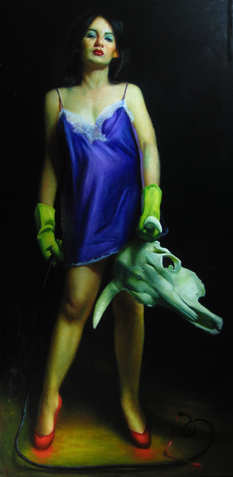
Rose Freymuth-Frazier | Woman Fighting Bull | 2007
June 30, 2023Rose Freymuth-Frazier | Woman Fighting Bull | 2007
I am tempted to simply comment that this is my offering – my criticism, in a visual manner – of the online debate around the exhibition at the Brooklyn Museum that purports to explore the misogyny of Picasso and what might be the inflation of his genius in the Western art canon. If you’re unfamiliar with what I’m referring to by this comment, this link may help.
There is a carnivalesque aspect – and attitude, with her figures – in much of Freymuth-Frazier’s artwork. Recurring motifs make her paintings like a story, and the gazes and stances have a cinematic quality. Humour – often dark, or with an amusing caustic edge – is also present in her rendered scenes.
I enjoy the elements in this that conflict and conflate with the title : the yellow cleaning gloves (when I see these, I can almost smell the rubber of them), the rich red heels that seem almost to bleed colour onto the floor beneath them, the fine negligee matching the eye shadow, and all offset by the ‘trophy’ of the bull’s skull gripped in a cavalier and triumphant manner. If some of Artemisia Gentileschi‘s tableau of the (appropriate, perhaps) beheading of outrageous men comes to mind, that is only fitting.
Freymuth-Frazier’s woman looks as though she just dealt with a situation that though not her fault became her responsibility and will brook no complaints – or any of your ‘bull’, if I may engage in a pun. It’s a look familiar to us from some of the women in Romina Ressia‘s metaphorical portraits. Less flippantly, Freymouth-Frazier’s figures are the children of Paula Rego‘s characters, too : sometimes presenting uncomfortable but unapologetic experiences, direct and engaging in formal and conceptual ways. There’s a description of Rego’s work that applies very well to Freymouth-Frazier’s too : “Her paintings are a cryptic glimpse into an intimate world of personal tragedy, perverse fantasies and awkward truths.”
Rose Freymuth-Frazier has studied at the Art Students League of New York and the New York Academy of Art.
From her site :
“Rose’s mother and grandmother were both artists. Her work draws from a deep connection to the women who came before her as well as German art and culture passed down through her German Jewish refugee family, particularly that which was labeled as “degenerate” art. Her large-scale figurative oil paintings draw on a range of sources from intimate moments with loved ones and her Persian cat, to the detachment of pinup and soft porn, stock photography, and advertisements. Through an exploration of the subconscious, she depicts themes both personal and universal.
Her work has been exhibited internationally, and is included in private collections around the world, including The Bennett Collection of Women Realist, Collection of Gillian Flynn, Collection of Milane Duncan Frantz and the Collection of Michele Peterson.”
Her site and much more of her fine work can be enjoyed here and her IG is here.
~ Bart Gazzola
Read More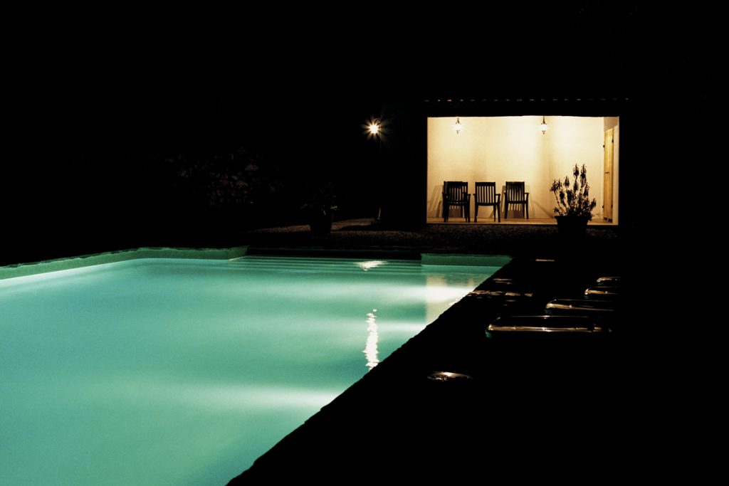
Alys Tomlinson | Dead Time | 2004 – 2006
June 23, 2023Alys Tomlinson | Dead Time | 2004 – 2006
“I like to remember things my own way.”
“What do you mean by that?”
“How I remember them. Not necessarily the way they happened.”
(from Lost Highway)
I’ve recently begun rewatching the third season of Twin Peaks (I mention this as Alys Tomlinson has spoken of Dead Time with allusions to the painter Edward Hopper but also that ephemeral notion of the Lynchian landscape): there’s a scene where Shawn Colvin’s version of Viva Las Vegas is a soft and enchanting soundtrack to the unfolding scene, and I happened to be listening to that song as I was perusing Tomlinson’s Dead Time series online. Vegas is, they say, a place where time is fluid, or can be lost or doesn’t exist in the same manner as elsewhere….
Tomlinson’s scenes are more Lynch’s Mulholland Drive or Lost Highway than Twin Peaks, with harsh artificial light casting edged shadows and revealing a sinister tableaux. Some critics have spoken of how time in the Lynchian universe – especially in Twin Peaks – is non linear, and Tomlinson’s images have an eerie familiarity (I’ve also travelled long distances by car and spent evenings in motels that, in recollection, blur together into one continuous banal experience).
There’s an element of the same unsettling darkness and emptiness that Steve Laurie employs in some of his images that also invite us to see them as film stills and create our own narratives for them. Tomlinson’s ‘America’ is empty, hard and bright. Swimming pools – usually sites of social interaction and enjoyment – are harbingers that seem more nefarious, here.
“For the past few years Alys has been photographing empty swimming pools at night in the UK and abroad. The images explore a twilight world of the in-between: a blurring of day and night, light and dark, the open and the enclosed, plenitude and absence. Whether municipal or members only, the pool is a space shaped by its patrons. Captured out of use, these familiar spaces stand outside time. Curved light breaks up the horizontal rigour. The comfort of transparency gives way to reflection and shadow. What is cedes to what could be, and the ordinary is transformed. The geographical location of each swimming pool is kept secret. Shot at dusk or at night, the pools take on a detached, almost melancholy, emptiness, and suggest a sinister feeling that something has happened, or is about to happen.” (from here)
Alys Tomlinson’s site can be seen here (she’s an award winning photographer and the diversity of her work speaks to her acumen with a lens, both formally and conceptually) and her IG is here. She has produced a book of these images, as well.
~ Bart Gazzola
Read More
Judith Schaechter | Eastern State Penitentiary | 2010-2011
June 16, 2023Judith Schaechter | Eastern State Penitentiary | 2010-2011
Schaechter works in a medium – stained glass – that is often consigned to the past, a method that most would be surprised to find is still employed by various artists. In terms of this, her thematic choices for this series of works installed in the Eastern State Penitentiary in Pennsylvania being a re interpretation of an allegory (most notably executed in 1559 by Pieter Breugel the Elder) that dates back over a thousand years is a melding of material and intent that literally shines.
It’s installation in a penitentiary offers even further intersections about indulgence and discipline, redemption and rashness, but also harkens to how this was a form of art that was essentially populist, offering narratives and stories to any who encounter it, even in unexpected places that foster moments of unanticipated joy.
Judith Schaechter is a very accomplished artist. She has lived and worked in Philadelphia since graduating in 1983 with a BFA from the Rhode Island School of Design Glass Program. She has exhibited widely across the United States, and has been the recipient of a Guggenheim Fellowship, two National Endowment for the Arts Fellowships in Crafts, The Louis Comfort Tiffany Award, The Joan Mitchell Award, two Pennsylvania Council on the Arts awards, The Pew Fellowship in the Arts, and a Leeway Foundation grant, and she is a 2008 USA Artists Rockefeller Fellow. Much more about her impressive career can be seen here.
An excerpt from her statement about her work:
“I found the beauty of glass to be the perfect counterpoint to ugly and difficult subjects. A radiant, transparent, glowing figure is not the same as a picture of a figure (which reflects light). It’s a blatant reference to holiness or some type of “supernatural” state of being. In terms of my figures, although they are intended to be ordinary people doing ordinary things, I see them as having much in common with the old medieval windows of saints and martyrs.
They seem to be caught in a transitional moment when despair becomes hope or darkness becomes inspiration. They seem poised between the threshold of everyday reality and epiphany, caught between tragedy and comedy.
It seems my work is centered on the idea of transforming the wretched into the beautiful in theme as well as design. For me, this means taking what is typically negative — say, unspeakable grief, unbearable sentimentality, or nerve-wracking ambivalence, and representing it in such a way that it is inviting and safe to contemplate and captivating to observe (to avoid ending with preposition). I am at one with those who believe art is a way of feeling one’s feelings in a deeper, more poignant way.
Medieval windows sought to confer inspiration and enlightenment to those who would see it. Beholding a stained glass window can enable, encourage, and literally enact the process of being filled with light. It sounds like some kind of preternatural phenomenon, but it’s a physical fact. While one is busy identifying and empathizing with the image, one also physically experiences the warming, filling sensations of light. It’s so persuasive not because the pictures are convincing narratives but because the colors are overwhelming and the light is sublime…”
Besides the imposing – perhaps edifying, considering its location – Lent work, Schaechter has also interspersed smaller slim artworks in various sites in the Penitentiary, with titles that evoke emotion and consideration like The Weeping Chorus, Confines, Mother or Sister.
Prisons are spaces that we ignore in most conversations about society, let alone cultural communities: except for when the ‘debate’ rears its ugly head in the public sphere about whether they are spaces designed for rehabilitation or purely for a punitive joy that usually seems to have a vague stench of hypocrisy about it. In imagining what it would be like to stand in the presence of these works, the idea of ‘redemption’ – a word I am uncomfortable with, as like too many words it is used with a biased or easy intent – comes to mind.
More of Judith Schaechter’s unique artwork can be seen here.
~ Bart Gazzola
Read More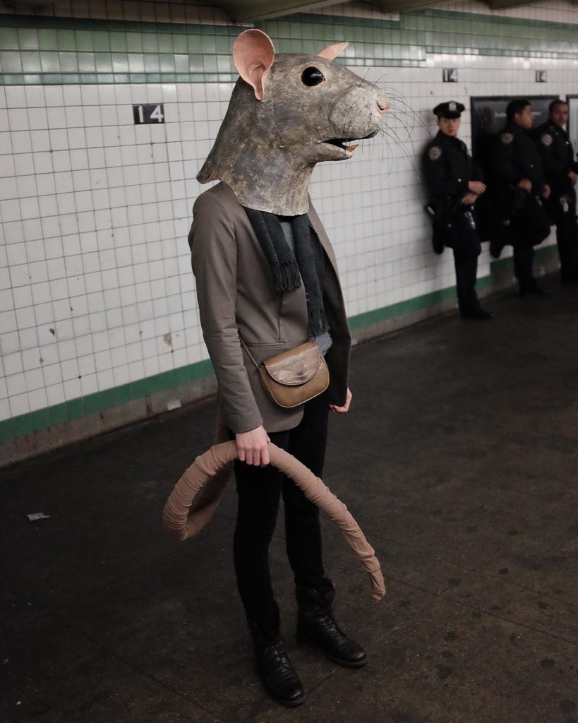
Liz Sexton
June 9, 2023Liz Sexton
“You aren’t a tiger. You’re a rat. No, that’s an insult to a noble and numerous species of rodent. You’re less than a rat.”
(Neil Gaiman, Anansi Boys)
When considering Liz Sexton’s Rat mask (which the artist created for Halloween and was documented in Brooklyn, New York, several years ago, amidst the visceral urban subway) and the stylish, self possessed Ratman I am initially reminded of the Rats (note the capitalization) and the Rat Speakers from the book Neverwhere.
Humour and horror (both heavily flavoured with the absurd in a delightfully performative manner) inform Sexton’s works. That’s one of the reasons why I included the images with her cat among those I’m sharing, as the cat’s unimpressed languor challenge the stoic existential nature of her ‘players’ (sometimes Sexton is the one donning the masks, other times not) that become something so much more in her masks, especially as they trod the public sphere. The Ravens (yes, I feel the need to formalize the characters in these scenes) on the subway may be harbingers of doom (if we’ve learned nothing from Edgar Allen Poe, don’t ask a Raven a question you don’t want answered, ahem) or simply out for the evening, on the way to meet fellow feathered friends : please don’t bother them, as a group of ravens IS called an ‘Unkindness.’
Other characters are engaged in equally banal every day activities, while others gaze directly back at us in a challenging manner, and others are captured in quiet moments of introspection, where we seem to be intruding on private moments.
Whether these are ‘disguises’ or new personas, I leave to your own discretion in any conclusion you make.
The words of the artist : “Most everything I create is meant to be interacted with, whether masks, puppets, or simply objects—they’re all intended to be worn, held, or touched….With the wearer concealed under a larger-than-life mask, it becomes as much a human with an animal head as an animal with a human body—a very interesting thing to interact with.
I often work on threatened species, particularly sea creatures, and photograph the animal masks worn in very human habits, highlighting the displacement that many creatures are currently experiencing. I also work on more common animals that we might share our surroundings with but don’t necessarily notice or engage with. Presented on a human scale, they share our world, becoming visible members of our communities.“ (from here)
In this light, I am also reminded of the moment – in Welland’s rust belt wonderland – when I met up with a fox late at night. Their unflinching gaze let me know who was the interloper, and it wasn’t them….
Liz Sexton has lived and worked in Paris, Berlin, and New York, and has recently returned to her Midwest roots, calling Saint Paul, Minnesota home. For now. Experienced in a wide range of mediums, these days she favors paper mâché for its versatility and accessibility. She enjoys creating sculptural objects, often inspired by the natural world.
Liz Sexton’s solo exhibition Out of Water is on view at the Minnesota Marine Art Museum May 6 – September 3, 2023.
Much more of her work can be enjoyed at her site here and her IG can be seen here.
~ Bart Gazzola
Read More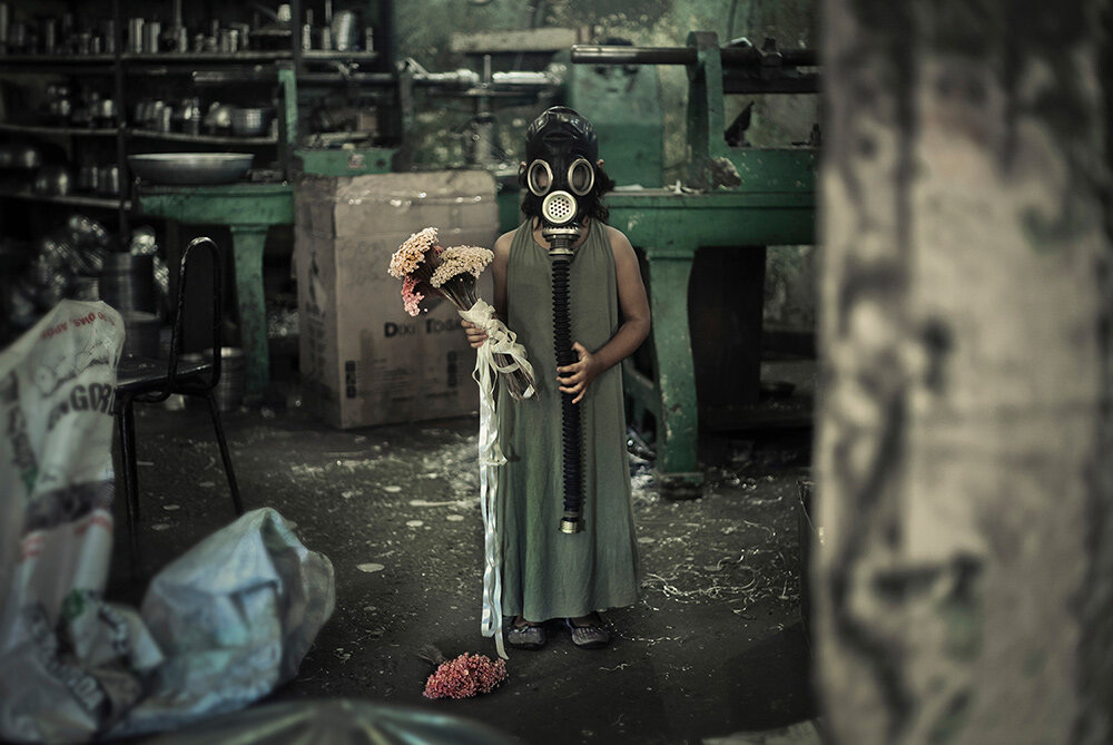
Hifa Cybe | Girl with the Gas Mask | 2020
June 3, 2023Hifa Cybe | Girl with the Gas Mask | 2020
I have heard the languages of apocalypse, and now I shall embrace the silence.
(Neil Gaiman)
Did you see the frightened ones?
Did you hear the falling bombs?
Did you ever wonder why we had to run for shelter when the promise of a brave new world unfurled beneath the clear blue sky?
(Goodbye Blue Sky, Pink Floyd)
I am convinced – though I’ve had difficulty tracking it down – that I read a line in Pasternak’s Doctor Zhivago, where one of the characters is talking of how, during the Russian civil war between the Whites and the Bolsheviks, it was a time when children only survived by eating the flesh of the dead (my memory of this line, even if invented, is quite visceral, and that intersects with some of Hifa Cybe’s work about memory – the veracity of it in personal narratives – too).
The quote I begin this piece with is – as some of you will know – from Pink Floyd’s The Wall, and this song always struck a chord regarding how in post WW II Britain a hoped for peace gave way to the Cold War, and that the idea – the fear – of an impending nuclear apocalypse – that we might bring about our own ending in a previously unimaginable manner – suffused a generation of children, as dour and suffocating and infecting as the bombs that ravaged people during WWII, and that do so still, now, perhaps forever….
I have little to actually say about Cybe’s artwork here : it’s power, simplicity in contradictions and the anxiety it induces are so intensely visual, so well executed, that my words would simply be a barrier to the viewer’s immediate engagement with it. An image like this also exposes the trite self aggrandizing act of Ai Weiei’s ‘reimagining’ of the image of drowned infant Alan Kurdi that in 2015 became the defining symbol of the plight of Syria’s refugees.
There is one thing to consider, though, in light of how Cybe’s research and artworks delve into trauma, especially in terms of memory and childhood. Here, in Niagara (as I make this post at the beginning of Pride month), we’re seeing the latest iteration of hatred against LBQT+ people, with a recent bilious spurt of it from a catholic school trustee : surely I’m not the only one who finds the rank stench of that hypocrisy, from a cult that has harmed so many – and so many children – too much? With this in mind, and looking at Cybe’s image, I am also reminded of friends I grew up with, in extremist religious environments, and that this scene might be a more exact psychological representation of their experiences, and tools of survival….
Luiza Jesus Prado, known as Hifa Cybe, is a transdisciplinary artist born in Guaratingueta, Brazil. She uses artistic tools such as photography, performance, video art, installation, sculpture, painting, new media, body art, music and drawing along with physics, psychology, neuroscience and philosophy. Cybe’s research is specifically on memory and the artist often explores topics of violence, sexual trauma, sociopolitical issues and minorities within Latin America.
This image is from a larger body of work under the aegis of Photo Homeostasis – Reprocessing Memories of Violence. The quote I began this essay with – from Neil Gaiman – is also the closing salvo from one of his stories in Endless Nights, which speaks of survival and even strength in the face of trauma.
Much more of Hifa Cybe’s artwork and research can be seen here.
~ Bart Gazzola
Read More
Rich-Joseph Facun | Little Cities | 2022
May 26, 2023Rich-Joseph Facun | Little Cities | 2022
…it takes an ocean of trust in the kingdom of rust…
(Doves)
The Cuyahoga River won’t kill you no more.
They cleaned it up back in ’74.
Well, you might get sick – but welcome to Ohio.
(Luke Doucet)
As I get older, there are some memories that still have an unexpected vivacity : and living again in the city and region where I grew up offers an odd looping of recollection, with elements of nostalgia – and the opposite of that, which might be cynicism or nihilism – informing and deforming my thoughts.
When I first encountered Rich – Joseph Facun’s images – specifically his Little Cities series – I felt transported back to my late teens and early twenties and shuttling back and forth between Windsor / Detroit and St. Catharines, seeing the underbelly of the rust belt wonderland. Specifically taking the train, and thus getting glimpses of smaller urban spaces across Southern Ontario that are often unseen or unconsidered, simply spaces to traverse on the way to somewhere else, not ‘valid’ to be ‘seen’ but as a space to be left behind or to be traversed with your mind – and destination elsewhere.
Facun’s scenes are part of a story that unfolds amidst the post-industrial United States – and these are spaces I’m familiar with from Niagara or the Windsor / Detroit region, that might be a ‘kingdom of rust’ or the ‘rust belt wonderland’ : a detritus of past ‘progress’, leavings of history that we might ignore or not acknowledge but that are literally part of the [memory of] landscape.
In Little Cities Rich-Joseph Facun “guides viewers on a meandering meditation through Southeastern Ohio by depicting the vernacular post-industrial landscape. In their quiet formality, the images call to mind past dreams, present disillusionment, and gently nudge us to look beyond what can be seen on the surface. Through recurring motifs, Facun excavates remaining signs of the Indigenous communities who once called this region home. In mankind’s hubris, we want to believe we shape the land we live on. Facun’s photographs remind us that the landscape contains memory, and it is witness to our misdeeds.” (from here)
Rich-Joseph Facun is a photographer of Indigenous Mexican and Filipino descent. His words : “His work aims to offer an authentic look into endangered, bygone, and fringe cultures—those transitions in time where places fade but people persist.
The exploration of place, community and cultural identity present themselves as a common denominator in both his life and photographic endeavors.
Before finding “home” in the Appalachian Foothills of southeast Ohio, Facun roamed the globe for 15 years working as a photojournalist. During that time he was sent on assignment to over a dozen countries, and for three of those years he was based in the United Arab Emirates.”
More of Facun’s work can be seen here and his IG is here. He has produced a publication for Little Cities, and I encourage you to spend some time with his Black Diamonds and 1804 series. Facun reminds me of Mary Ellen Mark‘s assertion as to how “photography is closest to writing, not painting. It’s closest to writing because you are using this machine to convey an idea. The image shouldn’t need a caption; it should already convey an idea.”
~ Bart Gazzola
Read More
Beth Galton | Aftermath
May 19, 2023Beth Galton | Aftermath
[Galton’s] photographs, created with the help of prop-stylist Bette Blau, investigate the consequences to reproductive health and freedom after the Supreme Court’s decision in June to overturn Roe v. Wade. Since then, information about how to give oneself an abortion has surged across social-media platforms. This is the sad, secret knowledge passed by rumor and word of mouth in the absence of safe and legal abortion care.
* * * * * * * * * * * *
Among the Dutch still lifes, there is a subgenre known as vanitas paintings, which serve to remind the viewer of her mortality through not-so-subtle emblems such as clock faces, burning candles and human skulls. Galton, making visible the private horror of terminating a pregnancy without the protection of the law, performs the gesture even more literally. Her still lifes force us to contemplate the possibility of the mother’s unnecessary death.
(Dana Goodyear)
Dr. Savita Halappanavar’s needless death is where we will begin in considering Beth Galton’s images Aftermath : The Overturning of Roe V Wade.
Halappanavar (1981 – 2012) “was a dentist of Indian origin, living in Ireland, who died from sepsis after her request for an abortion was denied on legal grounds. In the wake of a nationwide outcry over her death, voters passed in a landslide the Thirty-Sixth Amendment of the Constitution, which repealed the Eighth Amendment of the Constitution of Ireland and empowered the Oireachtas to legislate for abortion.” One might say that her gratuitously cruel death – which can be laid at the feet of the catholic church which for too long has denigrated justice in too many countries – galvanized the people of Ireland to a more humane and informed position.
If I may engage in a rude observation, it is notable when such a formerly staunch catholic country as Ireland can shed the barbarism of that cult to acknowledge the essential autonomous humanity of people. But perhaps the legacy of the Magdalene Laundries are clear in their minds….
Galton’s images are quiet : a superficial glance will not immediately reveal their truth, but these are as meticulously well executed as many of her more commercial works. But they are not initially recognizable for what they are, with their aesthetic acumen (or – perhaps more likely – as a man, I don’t recognize certain tools. Though I’m surely part of any intended audience, it is more so something I’m being taught rather than having a necessary yet unwanted familiarity with them….and that ignorance on my part is just a small piece of a leviathan of such willful ignorance of church and state in Galton’s country, and my own…).
In an article about this series here, notes are offered such as with Bodily Harm : “Bodily harm caused by wire hangers, knitting needles, douches and hard objects. Emblems from the nightmare past, in the spotlight of now.” Another – Back Alley Abortion – presents “objects traditionally used by medical professionals [that] are also used illegally to perform abortions. Also represented is the abortion pill, shipped to states where abortion is now illegal.”
Galtan is a citizen of the U.S., and this debate is raging there and – as happens with Canada – it’s spilling into our spaces, tainting any genuine informed debate with religious ignorance and outright lies and hypocrisy (I live in Niagara, where former ‘Bishop’ Wingle all but had a stroke when Dr. Henry Morgentaler was awarded the Order of Canada for his work in providing necessary health care. Wingle’s voracious hypocrisy only ceased when it was revealed that one of his ‘priests’ was a serial child molester, at which point he resigned, ran away and hid and the facts are still unclear on how much Wingle abetted or ignored. Do I truly need to ask why acolytes of this cult are being platformed regarding this issue, health care and so many others where their contribution is vile and ignorant?)
Galton’s works are subtle but have much to say : an award winning photographer who lives and works in New York City, Galton’s “images and short films tell stories – the story of memories, of what and how we eat together, a love of nature, and the pleasure of shared experiences.”
It’s also worth noting that the aesthetic discipline of Galton’s images – the beauty in horror, perhaps – is tempered by the facts of what she’s sharing.
Too often – which we’re seeing in Canada, right now – there’s intentional misrepresentation and outright lies around the issue (again, copying what happens south of us, where SCOTUS members lied outright about their intentions, and quote Medieval Witchfinders while bleating they are ‘moral’). Galton’s works remind us – those of us who never knew, choose not to know or hypocritically ignore – of facts : specifically that within the erroneously snivelling assertion of being ‘pro life’, that no such concern is shown – the opposite, in fact – for women.
More of this series can be seen here and Beth Galton’s site is here.
~ Bart Gazzola
Read More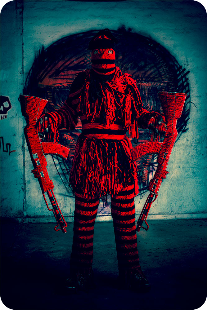
Ralph Ziman | The Ghosts Project
May 12, 2023Ralph Ziman | The Ghosts Project
The total life of man is reflected in his art. And so when people come to us and say, “Why are you… you artists so political?” I don’t know what they are talking about. Because art is political. And further more I’d say this, that those who tell you “Do not put too much politics in your art,” are not being honest. If you look very carefully you will see that they are the same people who are quite happy with the situation as it is. And what they are saying is not don’t introduce politics. What they are saying is don’t upset the system. They are just as political as any of us. It’s only that they are on the other side. Now in my enthusiasm, art cannot be on the side of the oppressor.
(Chinua Achebe in conversation with James Baldwin, 1981)
The ghosts won’t starve, but we will perish.
(Paul Virilio)
Since approximately 2014, South African filmmaker and artist Ralph Ziman’s The Ghosts Project has been enacted in a number of nation states in Africa. In Ziman’s words: “Arms that are paid for and imported into Africa are being used by individuals not just for defense but often by corrupt, autocratic governments to oppress their own people. This body of work deals with the international arms trade and Africa, a trade that for the most part only goes in one direction — into Africa — and one that not only fuels, but also sustains conflict across the continent.”
One aspect of the project involved Ziman photographing “Zimbabwean street vendors wielding handmade replicas of AK-47s which are adorned in traditional Shona-style beading. The multimedia project aims to highlight the international arms trade and its devastating influence.
Another iteration of this performative hybrid of fine craft and photography – and also an intervention into public spaces – is as follows: “I had six Zimbabwean artists use traditional African beads and wire to manufacture several hundred replica bead/guns like AK-47s, as well as several replica bead/general purpose machine guns (GPMGs), along with the ammunition. In response to the guns sent into that culture, the mural represents an aesthetic, anti-lethal cultural response, a visual export out of Africa. And the bead/guns themselves, manufactured in Africa, are currently being shipped to the USA and Europe. This bead/arms project provided six months full-time work for half a dozen craftsman who got well deserved break from making wire animals for tourists.
The completed bead/guns were the subject of a photo-shoot in crime ridden downtown Johannesburg. The subjects were the artists who made the guns, several construction workers who happened to witness the shoot, and a member of the South African Police Services who just wanted his picture taken.” (from here)
Ralph Ziman was born in Johannesburg, South Africa, and currently lives and works in Los Angeles, California : “His practice is motivated by a sense of social responsibility toward global politics. Using imagery that is at once vivid and dark, he comments on serious issues such as life under apartheid, the arms trade and trophy hunting. His work extends across a variety of media, including film, photography, public intervention, sculpture, and installation.”
More of Ralph Ziman’s work can be seen here.
~ Bart Gazzola
Read More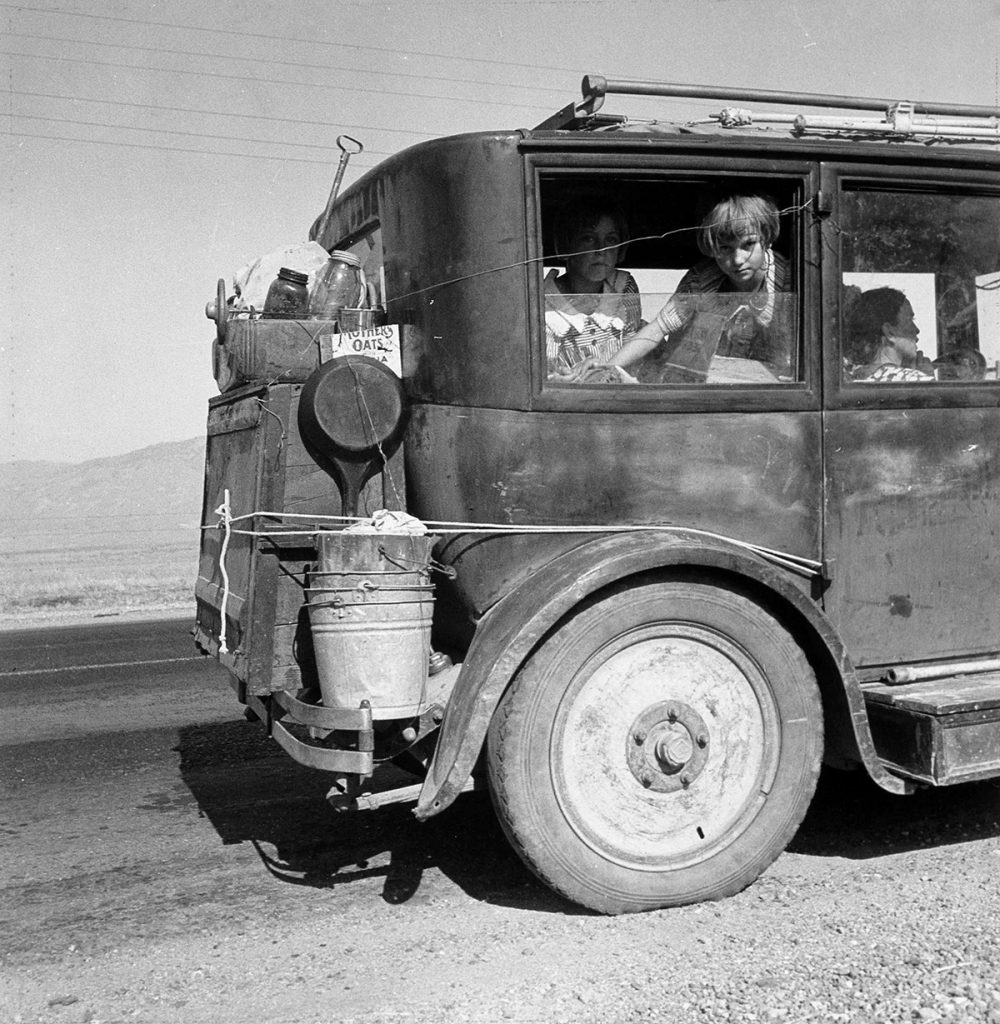
Dorothea Lange | A family of drought refugees from Abilene, Texas, on the road in California | 1936
May 4, 2023Dorothea Lange (1895 – 1965) | A family of drought refugees from Abilene, Texas, on the road in California | 1936
“The depression was making people disappear.
They vanished from factories and warehouses and workshops, the number of toilers halving, then halving again, until finally all were gone, the doors closed and padlocked, the buildings like tombs. They vanished from the lunchtime spots where they used to congregate, the diners and deli counters where they would grab coffee on the way in or a slice of pie on the way out.
They disappeared from the streets.
They were whisked from the apartments whose rents they couldn’t meet and carted out of the homes whose mortgages they couldn’t keep pace with, lending once thriving neighborhoods a desolate air, broken windows on porches and trash strewn across overgrown yards. They disappeared from the buses and streetcars, choosing to wear out their shoe leather rather than drop another dime down the driver’s metal bucket. They disappeared from shops and markets, because if you yourself could spend a few hours to build it, sew it, repair it, reline it, reshod it, reclod it, or reinvent it for some other purpose, you sure as hell weren’t going to buy a new one.
They disappeared from bedrooms, seeking solace where they could: a speakeasy, or, once the mistake of Prohibition had been corrected, a reopened tavern, or another woman’s arms—someone who might not have known their name and certainly didn’t know their faults well enough to judge them, someone who needed a laugh as badly as they did.
They disappeared, but never before your eyes; they never had that magic. It was like a shadow when the sun has set; you don’t notice the shadow’s absence because you expect it. But the next morning the sun rises, and the shadow’s still gone.”
(Thomas Mullen, The Many Deaths of the Firefly Brothers)
I have a tendency in my research to fall down rabbit holes: this is often shaped by history (my interest – which has manifested on this site – in post Soviet artists, for example) and of late The Great Depression has been a point of interest. My enjoyment of horror intersects here, so I will confess that I came to the author that I quote liberally above (whose book follows two brothers whom are bank robbers during the Great Depression, harshly factual and researched, but they find they are resurrected each time they’re killed in one of their robberies) through Daniel Knauf’s Carnivàle series. But, like another writer has pointed out, improbability and violence overflow from ordinary life, and the Great Depression was a time more, perhaps, malleable than most, as many assumptions were fractured irreparably…
And the horrors experienced by many from the Crash of 1929 through the Depression were ‘unimaginable’ to many, until they became commonplace, and now, it seems, have been forgotten. This is similar to how we forget that Lange’s subjects are not just icons but actual people who lived, suffered and died.
To many, Lange’s work requires no introduction. Many of her photographs are so stitched into the fabric of a communal history that they act as signifiers for collective memories. Nonetheless: Dorothea Lange “was an American documentary photographer and photojournalist, best known for her Depression-era work for the Farm Security Administration (FSA). Lange’s photographs influenced the development of documentary photography and humanized the consequences of the Great Depression.” (from here)
I return to Mullen’s book that had flavours of horror, but not in the way I expected, as it was more historical than ‘supernatural’ horror:
“Ten feet behind them, standing at the base of an arc light and looking in the opposite direction, was a young, balding man who Weston supposed was the father. The man looked as if he were trying very hard to become invisible.
When you bump into an old acquaintance on the street, you ask him how he’s doing. He tells you a story and then you tell him your story, and both of you are trying to see where you fit within the other’s. Your story says: This is the way the world is, and I’m the center, over here. But if the other guy tells a different story, with the world like this, where the center’s actually over here, then you realize that you’re way off to the side.
This man did not need to be told he was off to the side. He clearly realized it.”
More of Lange’s work – both her iconic images of The Great Depression and her later work that was more local but considered the same issues of justice and equality – can be seen here.
~ Bart Gazzola
Read More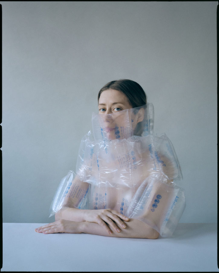
Kristina Varaksina | Self portrait wrapped, 2020
April 27, 2023Kristina Varaksina | Self portrait wrapped, from the Self Reflection series, 2020
“Why do men feel threatened by women?” I asked a male friend of mine. (I love that wonderful rhetorical device, “a male friend of mine.” It’s often used by female journalists when they want to say something particularly bitchy but don’t want to be held responsible for it themselves. It also lets people know that you do have male friends, that you aren’t one of those fire-breathing mythical monsters, The Radical Feminists, who walk around with little pairs of scissors and kick men in the shins if they open doors for you. “A male friend of mine” also gives — let us admit it — a certain weight to the opinions expressed.)
So this male friend of mine, who does by the way exist, conveniently entered into the following dialogue. “I mean,” I said, “men are bigger, most of the time, they can run faster, strangle better, and they have on the average a lot more money and power.” “They’re afraid women will laugh at them,” he said. “Undercut their world view.”
Then I asked some women students in a quickie poetry seminar I was giving, “Why do women feel threatened by men?” “They’re afraid of being killed,” they said.
(Margaret Atwood, Second Words: Selected Critical Prose, 1982)
Kristina Varaksina received her Master’s in Photography from the Academy of Art University, San Francisco, in 2013. Born in Russia, Varaksina has resided in the USA since 2010 and currently divides her time between London and New York.
From here: “In her personal work, Varaksina explores the vulnerabilities, insecurities and self-search of a woman and an artist. Her work is a creative response to what’s going on in the world and her immediate environment. Through visual symbolism, carefully curated colour palettes and cinematic lighting she reflects the strongest emotions she and her subjects experience.” I would inject another line from Atwood here, in response: I’m working on my own life story. I don’t mean I’m putting it together; no, I’m taking it apart.
Varaksina gives voice to women from different ethnic, socio-economic, and cultural backgrounds, each doing their best to accept themselves as who they are and be proud of that. Varaksina sees her job as a photographer to make “ordinary” women more visible and therefore, more valuable.”
Varaksina has earned numerous awards for her work: her figures alternate between an unflinching gaze that challenges – perhaps unnerves – the viewer, and a stillness where our presence is neither requested or needed, intruding into the quiet being of her subjects. The Self Reflection series – which is ongoing – has been described as both ‘claustrophobic’ and a commentary on the history of portraiture in the Western canon. In this body of work, her stare is direct and unrelenting, as she not only turns her camera on herself as part of her work about women but turns her gaze upon us, too.
More of her work can be seen here. Varaksina’s IG is @kristinavaraksina
~ Bart Gazzola
Read More
Recent Comments