In: Curators Picks
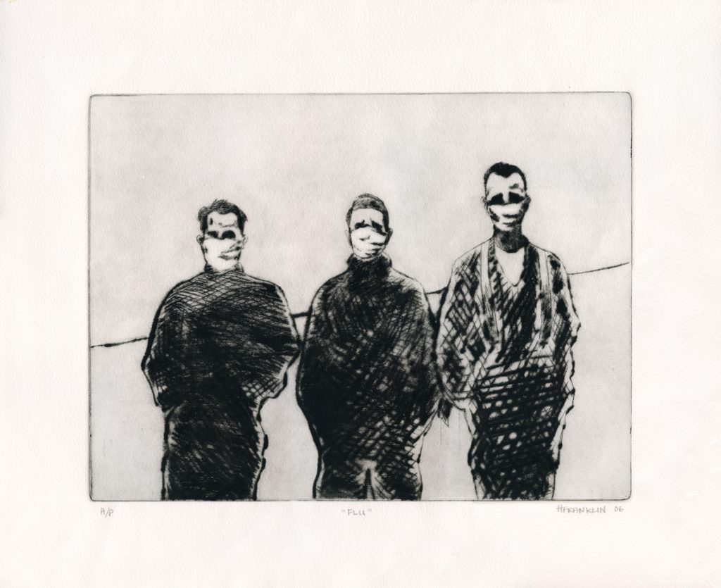
Heather Franklin | Flu
November 22, 2021Context is everything.
I first saw Flu, by Heather Franklin, in 2010. Heather, the Director of The Button Factory, Waterloo Ontario’s Community Arts Centre, made this drypoint print in 2006, drawn from a photo of three men during the Spanish Flu epidemic in 1918.
What drew me to the image was its strangeness. Three men, obviously out of doors (as indicated by the skewed horizon line, so likely to be farmers), in masks, facing an invisible, deadly threat. The title gave away the timeline and narrowed the reason for their masked anonymity to a necessity rather than a choice – they were not running from the law. But the masks still made them “others”, unrecognizable, in a situation I could not fathom. The print carried with it a sense of the uncanny, with a deep sense of foreboding.
In 2021, these men have become very knowable. They are us. They are simple people, dealing with a situation beyond their control in the simplest way they can. Now I find myself less concerned with the contagion swirling around them than with the economic straits they find themselves in, how their families are coping, whether or not they have lost loved ones. They have become human where once they were alien.
You can find more of Heather’s fine illustrations on her Instagram account @heathersphotophoto.
~ Mark Walton
Read More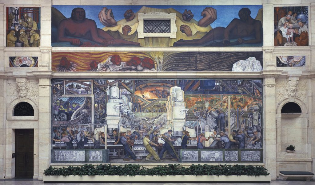
Diego Rivera | The Detroit Industry Murals
November 19, 2021Diego Rivera | The Detroit Industry Murals, 1932 – 1933
Diego Rivera’s work in the Detroit Institute of Arts, titled The Detroit Industry Murals, is one of the finest works of art of the 20th century, and easily one of the finest examples of a mural ever; it’s not inappropriate to appreciate it as the apex of the Mexican artist’s career, and it functions as a significant touchstone of not just the history of Detroit, but of North America and larger issues and ideologies that were dominant at the time of its creation but that still are prevalent now.
“Between 1932 and 1933, Diego Rivera completed this series of twenty-seven fresco panels entitled Detroit Industry on the walls of an inner court at the Detroit Institute of Arts. It was commissioned by capitalist Edsel Ford but conceived by the Marxist artist as a tribute to the city’s industries and labor force. Rivera used the Ford motor plant in Dearborn Michigan as the model for the industry murals. This plant, the Rouge Plant, spread all along the Rouge River, had a steel mill, glass factory, and auto assembly line. By the time Rivera visited these plants, the depression was in full swing but Rivera didn’t record accurately aspects of the Depression. Note, for example the predella panel where workers are lined up to receive their pay in front a parking lot filled with cars, a scene he would not have observed since the work force had been dramatically reduced. In addition to the automobile industry, Rivera chronicles the history and development of various other industries in the area.
At various times the murals have been controversial. Initially, some critics focussed on Rivera’s communism asserting that he had painted a communist manifesto. Others complained that the workers were depicted as dehumanized in the murals, even though most workers saw themselves as represented with dignity. Some complained that the nudes on the East wall were pornographic and saw the “Vaccination” panel as sacrilegious. Later, during the McCarthy era, a large sign was placed in the courtyard with the murals defending the artistic merit of the murals while attacking Rivera’s politics. More recently, a case has been made that the cycle is universal, reflecting “not only the essence of the industrial culture of Detroit but also a belief in technology and science that is operative today. As such, it is a history-making work of art in which the working class and industrialists both find affirmation.” And the aesthetic value of the series is no longer in doubt; many believe that this series of frescoes represent the best of Mexican mural art in the United States.”
This work also has to be seen as part of a larger series, including Rivera’s harsh Frozen Assets (1931 – 32) but also informing Self-Portrait on the Borderline between Mexico and the U.S. (1932) by Frida Kahlo, as they were a duo who contested and completed each other in their painting and ideologies. It’s also good to consider that too often, when engaging with art we privilege interpretations based upon ‘where’ we stand; this work – and the other ones I’ve mentioned by Rivera and Kahlo – looks at the United States with the eyes of an outsider (as I did, too, when I first visited it).
As a 19 year old new to the city of Detroit (and having my first real experience of the United States), The Detroit Industry Murals awed me (both in seeing the skyscrapers and trappings of the downtown that was the legacy of those glory days, and in stepping outside that bubble to the wasteland and abandoned industrial plants like detritus of a ‘better time’). To stand in the middle of the room, and be enclosed by these works, was a defining experience regarding both the possibilities and responsibilities of art. I’m offering a sampling of images here, but more can be enjoyed at this site: but truthfully, you must see this in person, in the downtown of Detroit, with all of its intersecting and contradicting narratives, and stand it its presence….
More images from this seminal work by Rivera can be seen here (and the long quote in this essay is also taken from there). ~ Bart Gazzola
Read More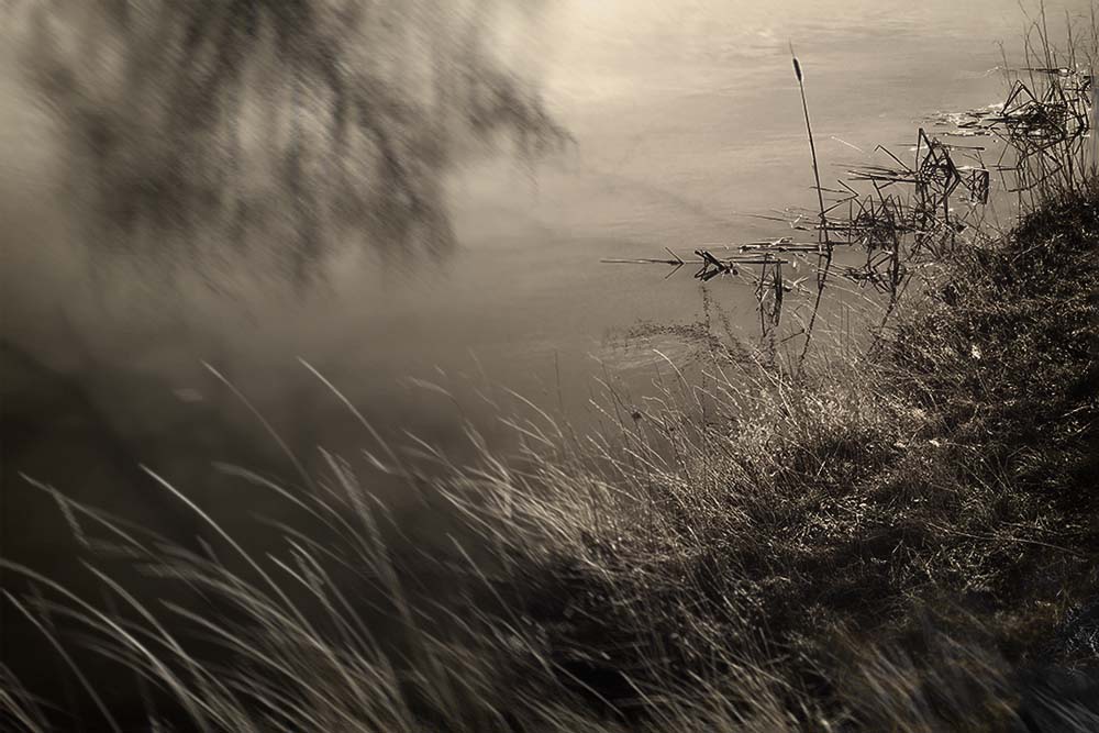
Diana Nicholette Jeon
November 11, 2021Diana Nicholette Jeon is a Hawai’i based photographer whose works have been widely published and exhibited, including (coincidentally) by The COVERT Collective’s Peppa Martin. Diana’s photos have won awards at the Julia Margaret Cameron Awards, the Moscow Foto Awards and the Pollux Awards to name a few.
“Untitled (from the series, 860 Days)” is a photo that immediately conveys a sense of solitude. The extreme blurring of part of the image takes it a step further to impart an unwanted sense of loneliness, and of not knowing how to escape it… like a bad dream. In fact, the series itself (here) is “about my experience of loss, isolation, anguish and loneliness during a marital separation.”
Jeon’s other projects are equally as personal and introspective, and often combine selfies with other photographic elements to create unique pastiches that engage the viewer to try to connect with the psyche of Jeon herself… what is she feeling here? … why did she choose this? While all art seeks to create this bond with its audience, Jeon’s work is extraordinarily successful at it.
You can see more of Diana’s work at her website, including the series Self-Exposure, Socially Speaking, Nights as Inexorable as the Sea and I, Orfeo.
https://diananicholettejeon.com/
~ Mark Walton
Read More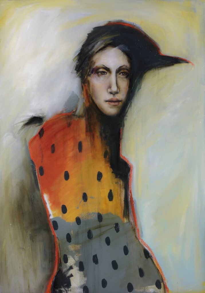
Michele Mikesell
October 31, 2021The Morrigan, 2017 by Michele Mikesell
Michele Mikesell’s characters peer back at you. Often, they seem to look through you. This is understandable as her inspiration is so often taken from mythology, with figures like this one (or ones, considering that the Morrigan is sometimes a trio, all sisters, called the three Morrígna) that embody larger ideas that dwarf the individual viewer. The imaginary portrait that Mikesell offers here is titled The Morrigan (but she / they are also called Mórrígan, sometimes named Morrígu, a powerful deity from Irish mythology. In Modern Irish she is Mór-Ríoghain, meaning “great queen” or “phantom queen”). A divinity of war and fate, often a harbinger who foretells doom, death or victory in battle, she’s often been depicted – as alluded to in the shadows here – as a crow (birds which still unsettle us as dark omens, or as scavengers of carrion, perhaps those who fall in battle….perhaps a psychopomp, even, waiting to escort the newly dead to their just reward…).
She looks fittingly unimpressed. (“It is better to fall in with crows than with flatterers; for in the one case you are devoured when dead, in the other case while alive.” – Antisthenes / Ἀντισθένης, c. 445 – c. 365 BC)
There’s a sense of whimsy to many of Mikesell’s anthropomorphic figures, blending animal and human, often titled for old gods like Artemis or Bastet. Another painting is titled Huginn, one of Odin’s ravens – another foreboding bird, knowing and seeing much. She lives in Dallas, Texas and Spain, and “her paintings hone in on the connectedness between human ideas and animal instinct. Irony, contradiction, humor and tragedy are themes throughout her work.”
Many more of her fine paintings (as it was very difficult to select just one) can be enjoyed here. ~ Bart Gazzola
Read More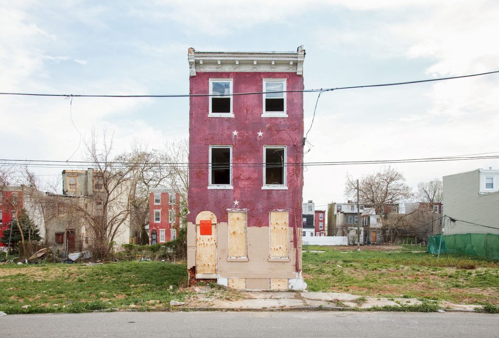
Philadelphia, PA, 2013 from Last House Standing by Ben Marcin
October 10, 2021
Philadelphia, PA, 2013 from Last House Standing by Ben Marcin
I spent a significant part of my formative years in the Windsor – Detroit area. When I visited Detroit, stepping outside of the immediate downtown into the areas that still bore the scars of history, I was often struck by singular houses – occupied or not, officially or otherwise – that stood like sentinels, like final gatekeepers, of areas that were empty and desolate. At that time, living near the Ambassador Bridge in Canada, the neighbourhood was picturesque and somewhat historic if a bit leaning towards dereliction: now, nearly three decades later, that section of Windsor is rife with shuttered houses, boarded up and abandoned.
Ben Marcin’s Last House Standing series is literally that: singular buildings, from Baltimore, New Jersey or – like this image – Philadelphia. These are all places with equally iconic stature as Detroit, and Marcin’s ‘figures’ alternately evoke gravestones or lone survivors, barely holding on, amidst the wastelands that have crept and grown up around them. Many seem like tombs; others bring an incongruous element of vitality with their vibrant colours, evoking T.S. Eliot’s ‘these fragments I have shored against my ruins’ (appropriately from his opus, The Wasteland).
Marcin also revisits sites. Thus, buildings that were barely holding on in 2011 are now gone, like they’ve never been, in 2020.
More of this series by Marcin can be seen here, at his site, or at his Instagram. ~ Bart Gazzola
Read More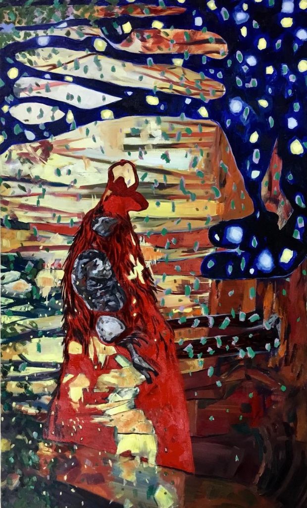
Throooom (a spell to wish away most days) – Scott Sawtell
September 21, 2021Scott Sawtell is a painter who straddles abstraction and symbolism, and the manner in which he applies paint means that repeated visits with his work may reveal aspects you missed previously. His works are often significant in size, and this painting is 3 feet by 5 feet, created in 2021 (I mention the size as often Sawtell offers scenes that we might step into, that although tumultuous and frantic, they have a vivacity and vividness that is inviting). One of a number of works currently installed at the Latcham gallery in Stouffville, his paintings offer the contradiction that they are individually seductive, and one can hold your attention, but as a group they create an environment, with pieces having a conversation, whether formally or with some of the narratives Sawtell alludes to, with rough forms or poetic, yet sly, titles.
Recently I’ve been engaging with the work of another painter, Tony Calzetta, and an observation about his work is apt here: there is the possibility of narrative in this painting, but not the necessity of it. It’s also worth considering Julian Bell’s remarks from his book What Is Painting? Representation and Modern Art : ‘In other words there was no prior context to the painting itself. The viewer’s eyes would submit, and the painting would act.’
More of Sawtell’s work can be seen here, at his site, and on his Instagram. ~ Bart Gazzola
Read More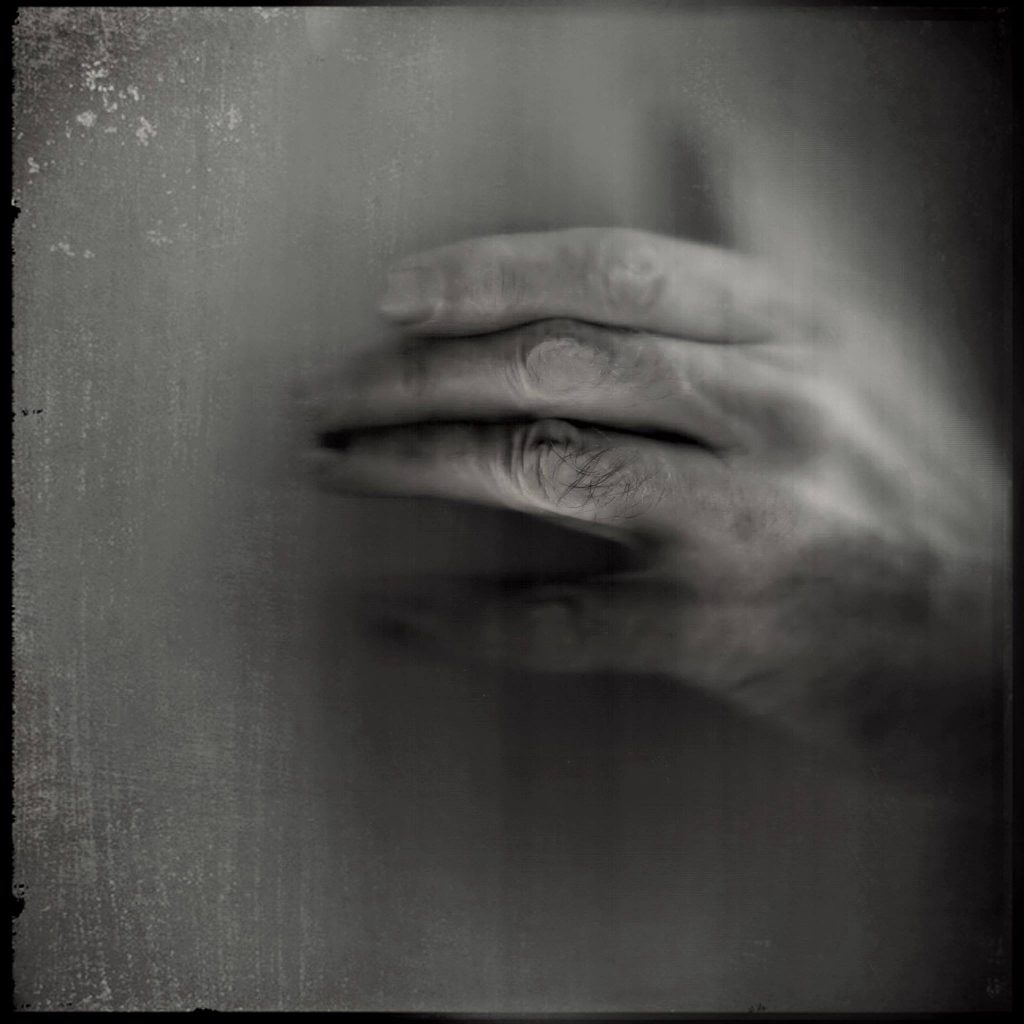
Mišo Smišek – Narrative Art
October 7, 2021Mišo Smišek of Belgrade, Serbia, is a consummate artist. He paints and draws. He is an incredible photographer and has illustrated numerous books. He is a regularly published and acclaimed writer of short stories. He sculpts. He creates pottery and does frottage. The breadth and scope of his work is quite simply impressive. Best of all, every piece he creates has the ability to elicit deep emotion from the viewer or reader of his work. Often dark but rarely disheartening or depressing, his work typically incorporates two or more mediums as above. Mišo has uncanny an ability to create a short story in every piece of his work.
At 64 years old, Miso studied Slovak language and literature at the Faculty of Philology of the University of Belgrade and currently works as a librarian in Boľovce. He posts regularly to social media.
Facebook: Mišo Smišek Art
Instagram: @misosmisek
~ Mark Walton
Read More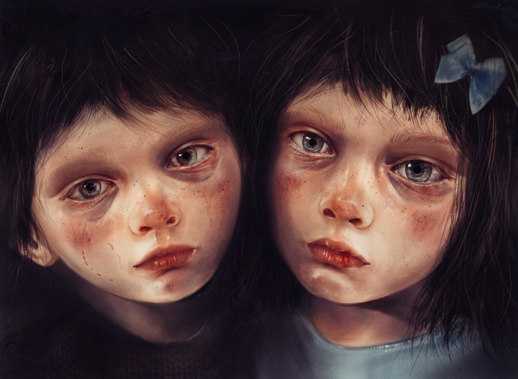
The Mark – Olga Volgina
August 24, 2021One of Olga Volgina’s more recent works that she’s shared on social media (as she’s a prolific artist) is a work that resonates in both an immediate and historical manner. Any (well made and meaningful) rendering of children has this power. Volgina’s children evoke a multiplicity of intersecting references: Goya’s portrait of Manuel Osorio Manrique de Zúñiga, who looks doll – like and innocent until a closer examination reveals several cats waiting to devour his pet bird, to the child’s indifference, is one. Delving even deeper into the worn faces and unflinching gaze of the children, I’m also reminded of Robertson Davies’ book World of Wonders. In response to one character relating his harsh yet essential childhood experiences, another defers that though he has experience “exploring evil” through his films, the evil of children is something that requires courage he lacks….
Volgina’s children must also bring to mind Ignorance and Want, from Dickens’ A Christmas Carol, and in that instance offer a more disturbing consideration of how a child is perhaps a larger reflection (or repository) for the world in which they live. Volgina commented that when this work – titled The Mark – was finished, “now I look at them and they look at me”, but what they see, or what they think, is opaque to us. We can guess; but the children in The Mark are silent and staring, offering no answers. Perhaps they’re indifferent to us, perhaps demanding, or perhaps simply exhausted and bruised.
Volgina lives and works in St. Petersburg, Russia. Her digital portraits, as she describes them, are both a bit unsettling and insightful. This brings to mind how sitting for some artists requires a degree of courage (never mind being nude but what of the deeper self that the artist might excavate and present for the world to see?).
See more of Olga Volgina’s work on Instagram, FB and at Etsy, where she and her twin sister, Liza Volgina, have a variety of engaging works on display. ~ Bart Gazzola
Read More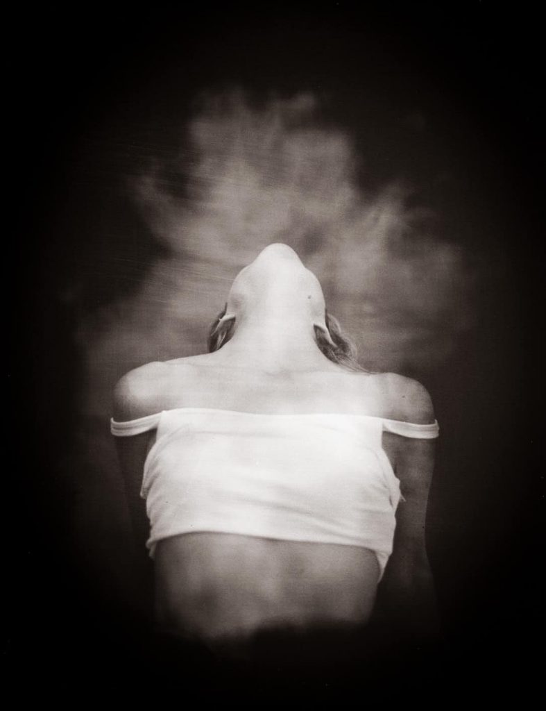
Fire Caught and Portrait of an Artist (Franklin Ugochukwu) – Kary Janousek
September 7, 2021![]()
There is an ethereal look to wet plate collodion photography that is difficult to describe. It’s no wonder that people thought that early photography was a method to steal the soul of the sitter; as you can recognize the individual, but they look detached, disconnected. The camera seems to catch something more than just the image of the person… it catches their essence.
The reason for this is that these images are primarily formed by collecting the UV light radiating from the subject, a light that is invisible to the naked eye. Kary Janousek (one of 4 of the “Dakota Revivalist Photographers” using wet plate collodion in North Dakota) uses this effect to beautiful ends. Fire Caught and Portrait of an Artist (Franklin Ugochukwu) are perfect examples of the process. Many of Kary’s images have spiritual undertones that are served well by the detachment. The images are of flesh and blood seem to transcend the glass plates they are formed on.
Based in Fargo, North Dakota, Kary is likely one of the only wet plate photographers ANYWHERE with a store front enterprise… walk in to her incredible studio in the historic center of town and you can have a plate made on the spot! Recently she has started experimenting with different types of glass, creating completely unique works of art.
You can find Kary Janousek at https://highhatportraiture.com and on IG @highhatportraiture
Shane Balkowitsch is another of the Dakota Revivalist Photographers and has been previously featured on curated.
~ Mark Walton
Read More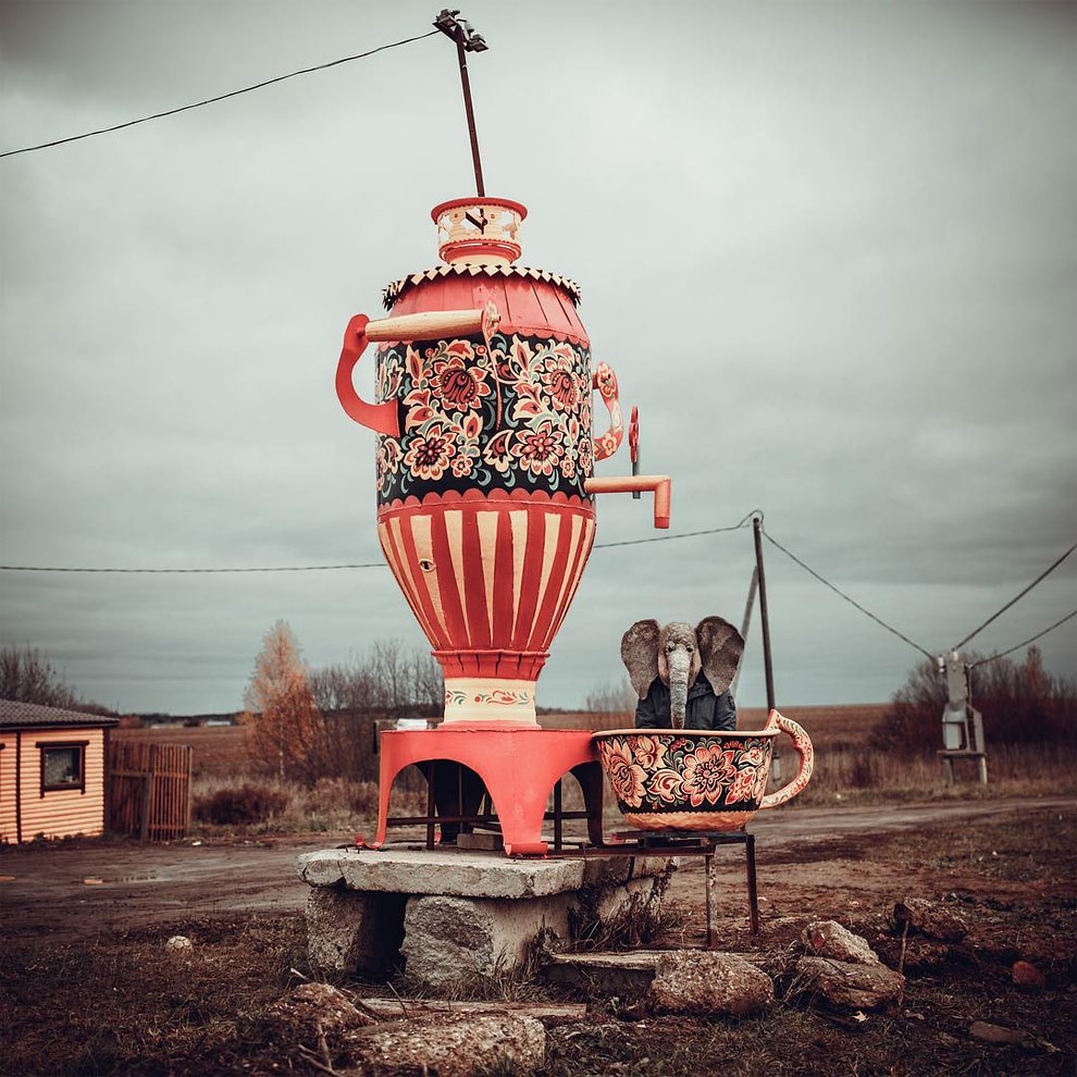
trunkdrunk
July 31, 2021Perhaps you’re familiar with the story of Pagliacci, the clown consumed by sadness he hides to make the audiences laugh. I will admit it will always be tied, for me, with Alan Moore’s Watchmen. In that graphic novel, Rorschach offers something of a lonely graveside eulogy for the character The Comedian (who ‘evolves’ from a snide position of ‘Once you realize what a joke everything is, being the Comedian is the only thing that makes sense’ to a weeping lament of “I mean, what’s so funny? What’s so goddamned funny?”). Rorshach recites a ‘joke’ about Pagliacci’s visit to a doctor, decrying his despair, only to be told by the well meaning doctor to visit the ‘famous clown’ to be cheered up. Pagliacci bursts into tears, revealing to the well meaning but unaware doctor that he is, in fact, the clown, and an empty shell who can’t even help himself…
The self described ‘comedian’ trunkdrunk occupies that same space. His Instagram page offers only that “I don’t even ask for happiness, just a little less pain.” An article on his work has the following spare and succinct comment: “trunkdrunk takes photos in Russia’s saddest places. As this was not sad enough, he takes pictures in full head overhead elephant mask. Images are captured in different places of Russia; mostly in gloomy and depressing surroundings.”
More of trunkdrunk’s images can be found on Instagram often accompanied by long swathes of text in Russian, that meld dourness, humour and memory. This image was originally posted to his IG account in October, 2016, with the following reminiscence: “Indian tea, the same – with an elephant. I remember him from my Soviet childhood. when my mother poured this Indo-Georgian mixture into a glass from a cardboard box, and then poured boiling water – the smell was stunning throughout the apartment!”
A previous Curator’s Pick of mine was a wonderful image by Alexey Titarenko: this could be said to have documented the fall of the Soviet Empire, in real time, with very real people as the unwilling players. Looking at trunkdrunk’s world, nearly forty years later, offers a new chapter to Russia history, perhaps attempting to laugh as one has no other choice, except to cry. ~ Bart Gazzola
Read More
Recent Comments