In: Female Artists
Diane Beard | Walking from the Darkness to the Light
October 2, 2023Diane Beard | Walking from the Darkness to the Light
“…life is brief and lovely, not long and foolish, that it is strange and beautiful, yeah as a dream, then so let it be, if it must be tears, if tears alone may serve…”
(Jack Kerouac)
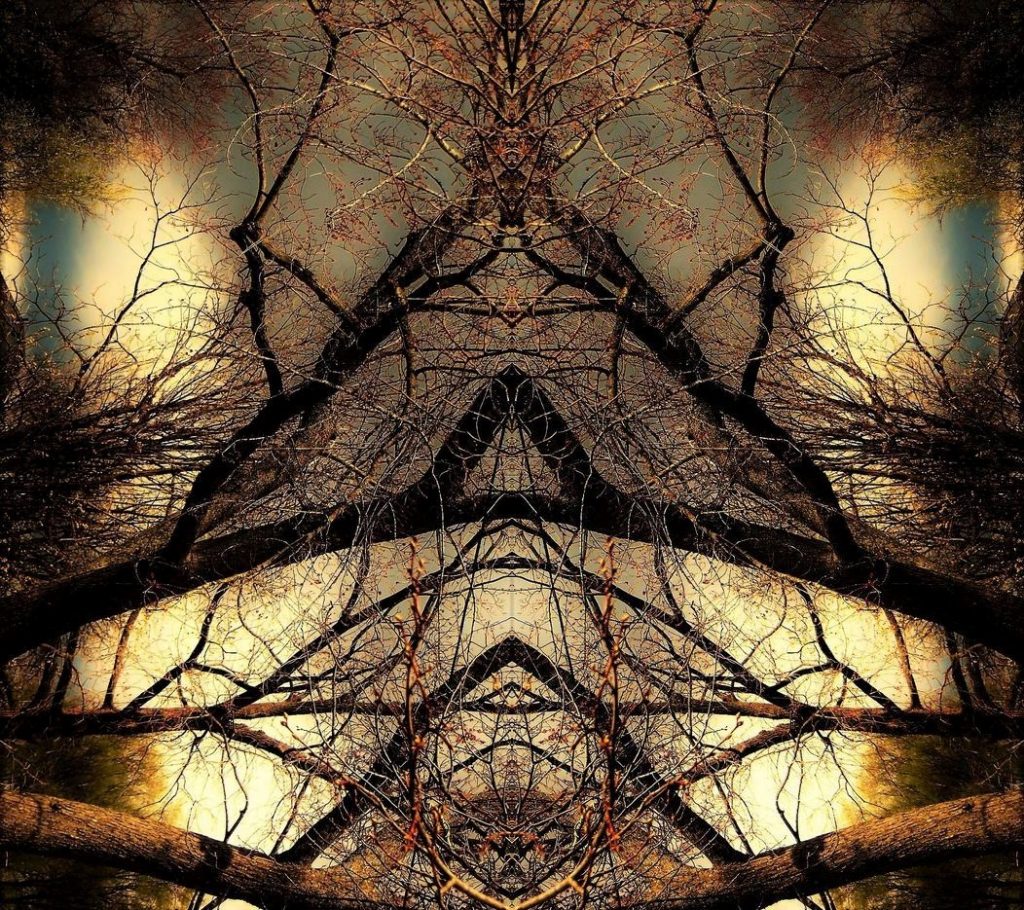
Diane Beard is a photographer who takes pictures of her immediate community of Welland (usually while walking the streets of the city), often manipulating the images digitally to have a surreal or abstracted quality.
She was one of the featured artists in the Welland Creatives Network’ 13 on the 13th exhibition at the Welland Historical Museum in 2022. We became acquainted during COVID, when the artists’ group I facilitate – the 5 x 2 Visual Conversations – began to ‘meet’ online, and Beard was an enthusiastic and impressive participant.
Diane is the widow of artist Ross Beard (1953 – 2019) who was arguably the most significant visual artist in the history of the city of Welland. Frankly, I prefer to say ‘is’ as a recent exhibition of his work indicated that he lives on in his artwork and the joy many find within it.
His passing was – is – a fracture in her life, and part of her response has been the many images she’s produced and shared, both online and in the Niagara visual arts community.
From a recent exhibition – which was titled Walking from the Darkness to the Light – in St. Catharines : “Having been surrounded by Ross’s awe-inspiring art, sharing the same love of nature and appreciation for the Niagara area, driven by grief combined with a loss of identity after Ross’s passing, yet with no formal training, Diane began taking photographs as means to express her feelings and emotions. Diane’s sense of color and form transcends a simple mundane scene into something abstract and at times unrecognizable mimicking the profound change in her life.”
I’ve been lucky enough to talk with Diane often about her work. The contrast between a scene you recognize and something completely alien is one of the aspects of her work that’s alluring. Beard has an innate sense of colour, composition and a vibrancy in her scenes. This vivacity is an appropriate challenge to the fact that these images are, at their genesis, about loss and mourning and how to move through that….
Beard shares images regularly on social media, and is a prolific artist. I’ve only shared a small part of her body of work, and more can be enjoyed here and here.
~ Bart Gazzola
Read More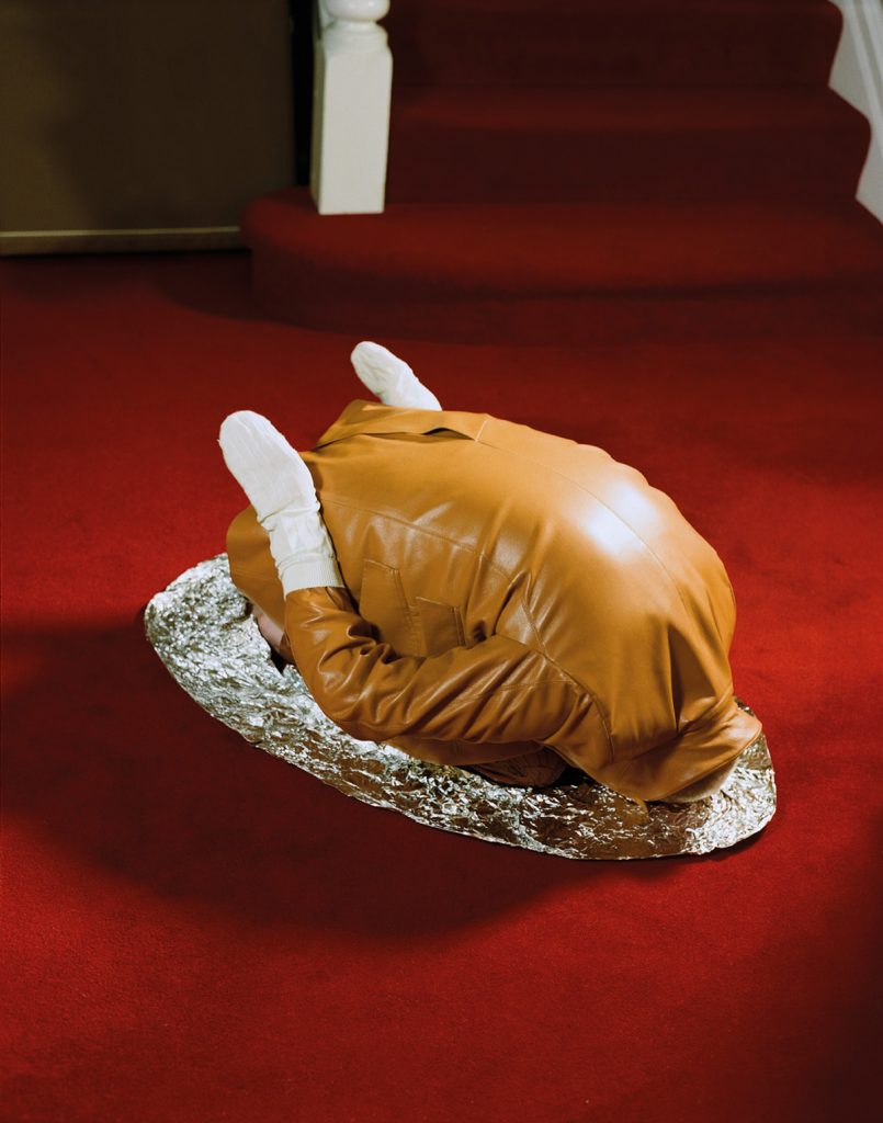
Annie Collinge | Table For One | 2020
August 25, 2023Annie Collinge | Table For One | 2020
With styling and art direction by James Theseus Buck and Luke Brooks of Rottingdean Bazaar, the Table For One series was created for Luncheon Magazine, featuring the model Tin Gao.
There are a number of places to stand (or crouch, on your knees with your head tucked under, like the resting chicken ‘downward dog’ work by Collinge) in considering Table For One.
Some are more light-hearted (when I first encountered Collinge’s performative scenes, I was having the type of day where staying at home in a banana bag or sitting stoically as a snug, solitary tomato was a comforting concept. Table For One might mean being grateful to be left alone, that day). Other responses may be darker : perhaps these are incongruously bright, vibrant metaphors for loneliness and separation. Eating alone at a table for one is interpolated as isolation – and assumed to be by reluctance not preference – which feeds (sorry) into the history of how eating with others and communal meals are lauded as linchpins of social structure. This is – of course – debatable, as it has a rank stench of nostalgia, like those who lament the myth of ‘family dinner.’
I offer this as someone who often goes to movies alone, or eats in restaurants alone, but have been told I’m ‘extroverted’ in other social interactions.
When considering art, I often cite what Jeanne Randolph describes as the ‘amenable object’ : it’s a ‘vessel’ that we pour our own experiences into, and thus construct its meaning in collaboration with the artist. Fashion falls within this, and is also a manifestation of art and social history : its a history we wear and perform. As with art history, it is sometimes subversive, sometimes explicit. Table For One exists within that space.
“Puppetry, dolls and larger-than-life costumes populate the images of London-based photographer Annie Collinge. Visual trickery abounds, as if Alice had just stumbled upon a magic potion in Wonderland, with scale (the very large and the very small) frequently distorted. The human body becomes a foil to its surroundings, offsetting imaginative surroundings that conjure the escapist storybooks of childhood. A head appears amidst a mushroom patch, or else a gloved hand clutches at a disembodied head. Like the best fairytales, these images carry as much menace as they do whimsy.” That quote is from an interview with Collinge : more of that conversation can be read here.
More of Collinge’s artwork (sometimes collaborative, sometimes solo) can be seen here and here.
~ Bart Gazzola
Read More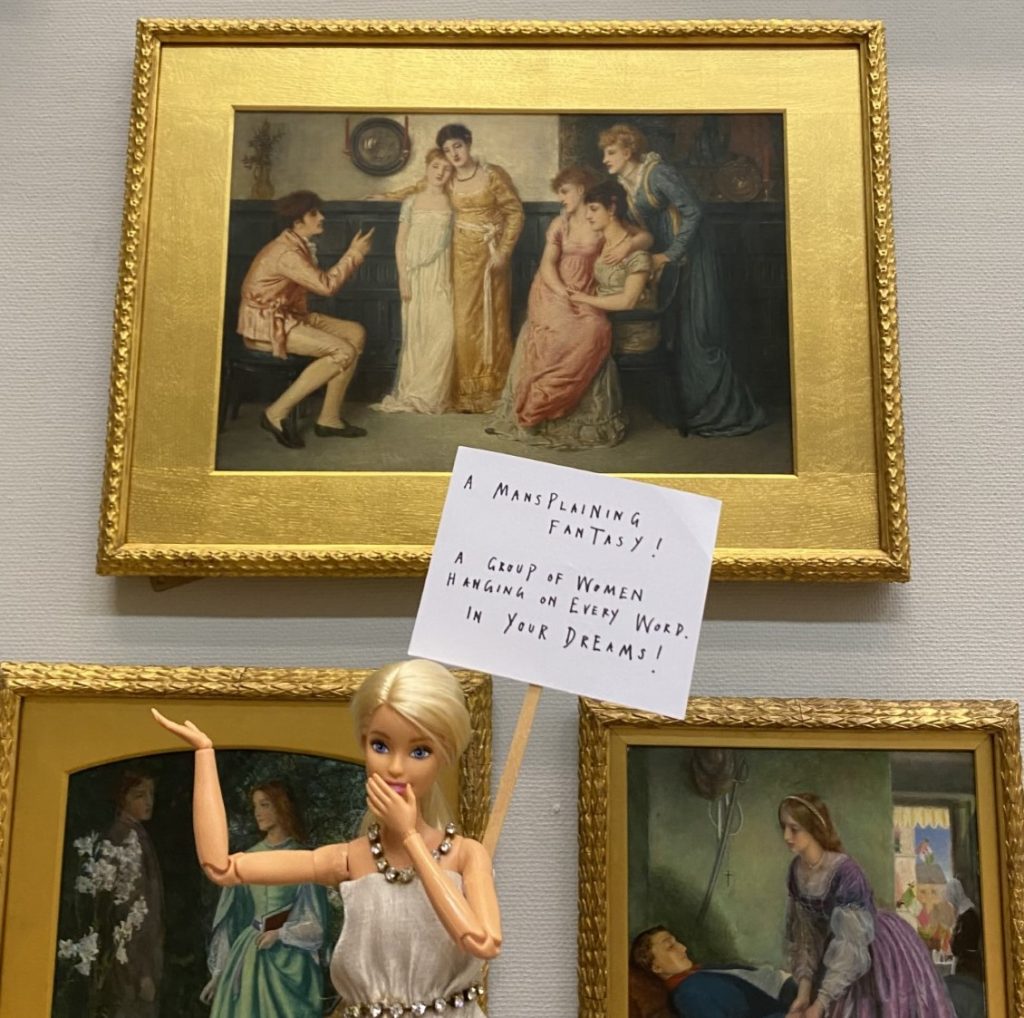
ArtActivistBarbie | Dr Sarah Williamson
August 11, 2023ArtActivistBarbie | Dr Sarah Williamson
Many years ago, when I was still working in art galleries, I was intimately involved with the first full ‘inventory’ of the Kenderdine Gallery’s art collection (now the College Gallery, at the University of Saskatchewan). This task involved documentation both visual and written, from shooting slides (yes, I am that old) and creating or augmenting artist and artwork files.
At one point, a coworker and I realized that there were more works by unknown artists than there were from female artists, let alone ‘contemporary’ ones : but I also remember an acquisitions meeting where yet another passel of karaoke modernist paintings by a second rate male artist were being considered for purchase (despite, as I pointed out, one of the people on the committee was the son in law of said artist, and we already had many works by this artist, and many more lesser imitations in this derivative genre. Unsurprisingly, I was asked to leave the meeting…).
I can’t help but feel nobody would be able to make ArtActivistBarbie leave, in a similar situation (yes, I am smiling as I type that). A performative persona of Dr Sarah Williamson, it feels appropriate to speak of ArtActivistBarbie as a person, unto herself, in this essay.
If you’re still swimming in that cesspool known as Twitter – sorry, ahem, ‘X’ – then perhaps you are already familiar with ArtActivistBarbie (@BarbieReports) who “has a finely tuned eye when it comes to calling out gender inequality in the arts, and she is not afraid of making a scene. Her provocative wit and fabulous wardrobe lend themselves to staged interventions, predominantly in art galleries and museums. Posing with her tiny, pithy placards, ArtActivistBarbie is photographed gently mocking or drawing attention to problematic exhibits and the images are shared with millions of Twitter users. She also challenges the biases inherent in so many curatorial labels and statements.
ArtActivistBarbie seeks to change the practices of these institutions, the bulk of whose collections have historically been commissioned and produced by men, representing many centuries of male power and privilege. Over 94% of artworks in publicly funded galleries [in the UK] are by white men and many objectify and demean women and girls. Making visible the lives and experiences of women and minority ethnic groups is vital for a more just and equal society.” (from here)
The origin of ArtActivistBarbie is thus : “The woman behind the project is Sarah Williamson, a senior lecturer in education and professional development at the University of Huddersfield. A few years ago, she was trying to find a way to engage her students with social-justice issues and feminist ideas, especially the problematic way women are portrayed in art. She wondered if Barbie, that plastic idealised woman, could become a vehicle for playful commentary on the “patriarchal palaces of painting”. Soon Williamson was gathering a doll army, clothing it in pieces handmade by her feminist mother in the 1970s, with new additions created by her sister. She handed each of her students a Barbie doll and a blank placard on a lollipop stick, then set them loose in Huddersfield Art Gallery.
The resulting mini-protest signs stopped visitors in their tracks, and the photographs of Barbie’s protests drew plenty of notice back in Williamson’s office: “I realised I had something which attracted everyone’s attention and catalysed conversations about how women are portrayed and represented not only in art, but society in general.”” (from The Guardian)
It’s also necessary to consider how “museums are somewhat newly self-reflexive about their role in shaping the culture and the discourse, and are working hard to stay relevant and expand the canon—and to grow their audiences.” (That’s from a recent article in ArtNews that appropriately decries the slipshod ‘critique’ offered by the Brooklyn Museum’s exhibition Pablo – matic – and although ArtActivistBarbie seems to ‘shoot from the hip’, her aim is more accurate, and considered, in the larger discourse of whom and what cultural institutions serve – and don’t….)
Much more about ArtActivistBarbie’s caustic yet comedic commentary (comedy, it has been said, is just rage in fancy dress, and Barbie has no shortage of snazzy outfits) can be enjoyed here. There are a number of interviews with Dr Williamson that are as educational as they are engaging.
~ Bart Gazzola
Read More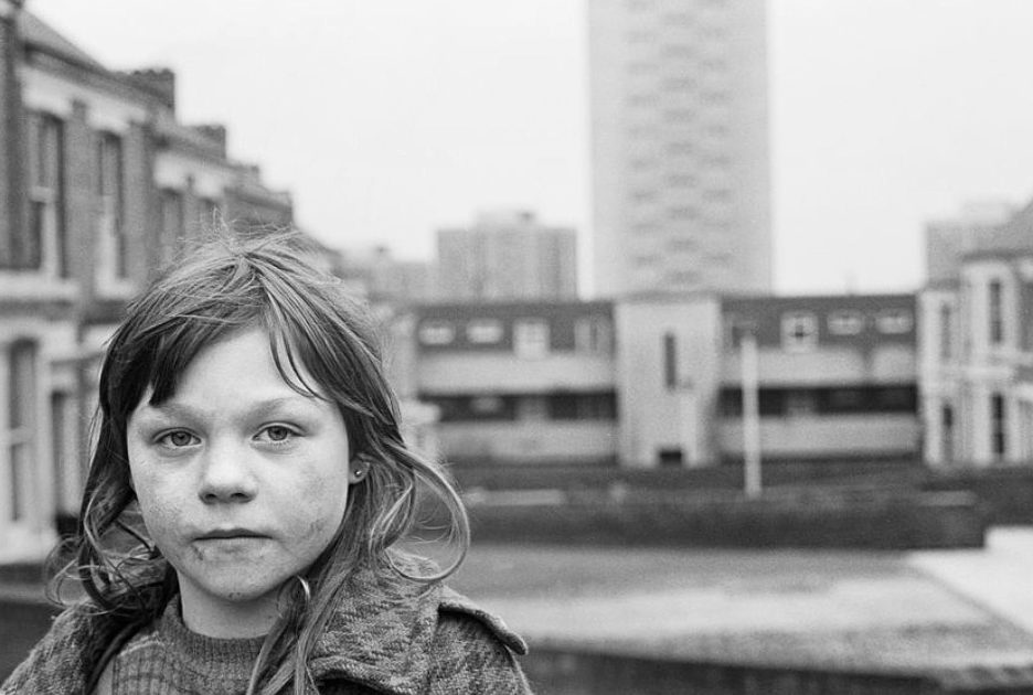
Tish Murtha | Elswick Kids | 1978
August 4, 2023Tish Murtha | Elswick Kids | 1978
All we wanted was everything. All we ever got was coal.
(Bauhaus, from the album The Sky’s Gone Out, 1982)
Patricia Anne “Tish” Murtha (1956 – 2013) was a British photographer best known for her images of working class life in Newcastle upon Tyne and the North East of England. Murtha’s work is a raw documentation of these communities – and often youth within these social groups – at a time when British Prime Minister Margaret Thatcher waged war on her own citizens, embracing a neo – liberal cruelty that is like a virus whose symptoms can be still seen in contemporary post Brexit Britain.
The images captured by Murtha evoke notions of a ‘third world’ country, with the scenes of desolate and despairing youth amidst a wasteland that – being shot in black and white – emit a hopelessness that reaches across the decades. Or perhaps it is simply combining with the contemporary desperation among working class communities in these places now.
From here : “In 1976, aged 20, Tish left home to study at the famous School of Documentary Photography at The University of Wales, Newport under the guidance of Magnum member David Hurn.
She took many photos in Newport, including The former Prime Minister James Callaghan opening up a new stretch of the M4, as well as documenting Aubrey Hames’ year as Mayor of Newport in the Queens Silver Jubilee year (1977-1978). Tish also worked with the South Wales Argus during this time and photographed the local election campaigns.
When she returned to Newcastle, she began to document the lives of her friends and family and numerous other projects.
Tish’s work was often concerned with the documentation of marginalized communities from the inside. She invested her time building relationships of trust, which allowed her access to different parts of the communities that she photographed. Her approach was informal, generating an understanding of what she was doing by giving copies of her photos to the people in them. The young people she photographed as part of the Youth Unemployment and Juvenile Jazz Band exhibitions showed how tenacious, resourceful, clever and resilient they were (and had to be) – Tish was always fiercely protective of them.
She felt she had an obligation to the people and problems within her local environment, and that documentary photography could highlight and challenge the social disadvantages that she herself had suffered.”
Three books of her photographs have been published posthumously : these are Youth Unemployment (2017), Elswick Kids (2018) and Juvenile Jazz Bands (2020).
More of Tish Murtha’s work and her life (as her daughter is maintaining her archive and ensuring her mother’s work is given its appropriate place in terms of history and art) can be seen here.
~ Bart Gazzola
Read More
Saint Alexander Nevsky Monastery, Leningrad, USSR | Masha Ivashintsova |1977
July 21, 2023Saint Alexander Nevsky Monastery, Leningrad, USSR | Masha Ivashintsova | 1977
I was not born
to amuse the
Tsars.
— Alexander Pushkin
I loved without memory: is that not an epigraph to the book, which does not exist? I never had a memory for myself, but always for others.
— Masha Ivashintsova
Masha Ivashintsova has been described as a ‘Russian Vivian Maier‘ as she took so many photographs – creating a world, in a way, of her city – in her lifetime but most of them have only been shared since her death. Her eye for contemporary life under the Soviet regime – especially in St. Petersburg later Petrograd later Leningrad then again St. Petersburg (the shift in name and what that entails in the socio political sphere is a good place to stand, when considering Ivashintsova’s photographs) – was an honest and personal portrait of her life and times. One might argue that the veracity of these experiences captured with her lens were – are – so honest and powerful that we can understand why she held them to herself for so long. Her own personal history was also painful, and that was surely a factor, too.
Or, perhaps as I allude to with the quote from Pushkin, autocratic, authoritarian societies prefer facile propaganda and punish uncomfortable truths….
Ivashintsova (1942 − 2000) was a photographer based in Saint – Petersburg (then Leningrad, in the USSR) “who was heavily engaged in the Leningrad poetic and photography underground movement of the 1960−80s. Masha photographed prolifically throughout most of her life, but she hoarded her photo-films in the attic and rarely developed them. Only when her daughter Asya found some 30,000 negatives in their attic in 2017 did Masha’s works become public.”(from here)
“Struggling with life under Communism, by the mid-1980s Masha was committed to a mental hospital against her will, as a way to get her in line with the USSR’s philosophies. Working throughout her life as a theater critic, librarian, cloakroom attendant, design engineer, elevator mechanic, and security guard/riflewoman, she was a chameleon, always camouflaging her inner artist. Only through her diaries and photographs was she able to show her true self.”
A fine article – and interview – with her daughter Asya Ivashintsova-Melkumyan can be enjoyed here. A site devoted to Ivashintsova’s amazing archive can be seen here : as well, there is a social media page that shares her work at regular intervals here.
~ Bart Gazzola
Read More
Yuka Yamaguchi | Inseparable | 2006
July 14, 2023Yuka Yamaguchi | Inseparable [離れられない] | 2006
If there is love, smallpox scars are as pretty as dimples.
(Japanese proverb)
There is a simple elegance to Yagmaguchi’s work that sometimes belies the visceral content. I was lucky enough to experience her work in person, in an exhibition years ago that purported to showcase contemporary Saskatchewan artists. There were too many artists in the show, some of middling ‘quality’, but Yamaguchi’s unique style and subject matter was a high point of that exhibition.
Her use of very simple tools is perfectly matched to the illustrative nature of her images, which are as much about storytelling as a disciplined but playful aesthetic.
The title of this work can also be translated from Japanese as ‘Can’t Leave’ : but I don’t interpret that in a negative context, and still read this work as a more bodily or corporeal valentine’s card. The rawness is just another way of depicting the intensity of the feelings of being ‘inseparable.’
Yuka Yamaguchi is a self-taught visual artist from Kobe, Japan who has lived in Saskatoon since 2005.
Colour pencils and paper are her preferred medium as these tools allow for strong colors even though they are fragile and delicate. Yamaguchi “draws intuitively as she sees an image appear on paper and keeps adding images like a puzzle.”
More of Yuka Yamaguchi’s artwork can be seen here.
~ Bart Gazzola
Read More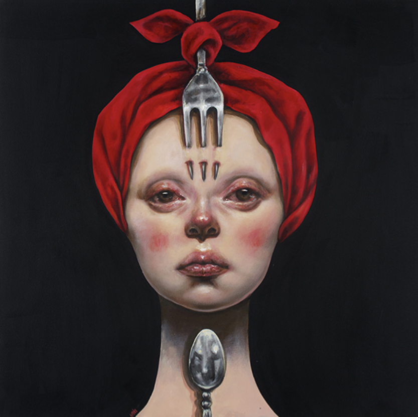
Afarin Sajedi | Chef Offer | 2013 – 2014
July 6, 2023Afarin Sajedi | Chef Offer | 2013 – 2014
“You will eat less than you desire and more than you deserve.”
(from The Menu, 2022)
The works in Sajedi’s Chef Offer series have evocative if direct names (I prefer to say ‘names’ over artwork titles in deference to her figures, with their poise and power).
These includeThe Soldier (2013), Like A Queen (2013) and Like A King (2013). The header image – breaking this pattern – is simply Fork (2013). The latter seems less stoic and more a warning to the viewer meeting her gaze….
Even the superficially absurd head pieces that her women wear are less amusing than unsettling in their elaborate nature: the pale faces, flushes on the cheeks and uncanny presence of the women in Chef Offer inspire anxiety more than amusement…
I recently rewatched The Menu, a horror film about the pretentious restaurant ‘scene’ that is rife with dark humour. Many of the harsh if unflinching ideas in The Menu are present in another horror film that dryly mocks the art world : Velvet Buzzsaw (2019). With both of these films I have rarely laughed so hard – and appropriately – at horror. Both of these films came to mind in considering Sajedi’s Chef Offer series.
The women that Sajedi ‘offers’ us seem to have an affinity to the Menu character Elsa, whose inscrutable, amused hint of a smile portends nothing but appropriate suffering for the ‘diners.’ It’s Elsa’s words I opened this essay with : and the exchanges of dialogue in The Menu offers a place to stand and consider Afarin Sajedi’s women in Chef Offer.
An example (and try to read this without picturing one of Sajedi’s women speaking as Chef Slowik, here):
Chef Slowik: So, the question is, do you wanna die with those who give, or with those who take?
Margot: But I die either way? It’s arbitrary.
Chef Slowik: No, it’s not arbitrary. Nothing in this kitchen is arbitrary. Please pick. These decisions are important, and, uh, our menu is strictly timed. In 15 minutes, I’ll take a break between courses, and that is how long you have to decide. It’s our side or theirs. In the meantime, please return to your seat. The next dish is exquisite.
Afarin Sajedi was born in 1979 in Shiraz and relocated to Tehran in Iran to study at Tehran Azad University where she earned a degree in graphic design. Afarin’s paintings are marked by a melding of technique and creativity, and often powerful in their presentation. Her subjects include theatrical characters, sometimes with overtly colourful, almost clownish faces, that are inspired by Japanese theater in tandem with symbols of western religious art that contrast and collide with the contemporary world. Afarin’s “characters are usually royal, proud, and silent with a deep look.” (from her site)
More of her work can be seen here and her IG is here.
~ Bart Gazzola
Read More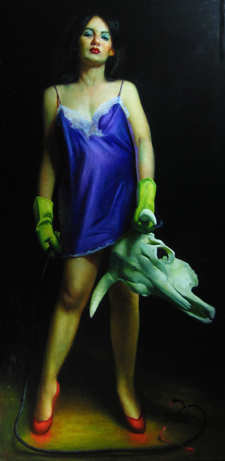
Rose Freymuth-Frazier | Woman Fighting Bull | 2007
June 30, 2023Rose Freymuth-Frazier | Woman Fighting Bull | 2007
I am tempted to simply comment that this is my offering – my criticism, in a visual manner – of the online debate around the exhibition at the Brooklyn Museum that purports to explore the misogyny of Picasso and what might be the inflation of his genius in the Western art canon. If you’re unfamiliar with what I’m referring to by this comment, this link may help.
There is a carnivalesque aspect – and attitude, with her figures – in much of Freymuth-Frazier’s artwork. Recurring motifs make her paintings like a story, and the gazes and stances have a cinematic quality. Humour – often dark, or with an amusing caustic edge – is also present in her rendered scenes.
I enjoy the elements in this that conflict and conflate with the title : the yellow cleaning gloves (when I see these, I can almost smell the rubber of them), the rich red heels that seem almost to bleed colour onto the floor beneath them, the fine negligee matching the eye shadow, and all offset by the ‘trophy’ of the bull’s skull gripped in a cavalier and triumphant manner. If some of Artemisia Gentileschi‘s tableau of the (appropriate, perhaps) beheading of outrageous men comes to mind, that is only fitting.
Freymuth-Frazier’s woman looks as though she just dealt with a situation that though not her fault became her responsibility and will brook no complaints – or any of your ‘bull’, if I may engage in a pun. It’s a look familiar to us from some of the women in Romina Ressia‘s metaphorical portraits. Less flippantly, Freymouth-Frazier’s figures are the children of Paula Rego‘s characters, too : sometimes presenting uncomfortable but unapologetic experiences, direct and engaging in formal and conceptual ways. There’s a description of Rego’s work that applies very well to Freymouth-Frazier’s too : “Her paintings are a cryptic glimpse into an intimate world of personal tragedy, perverse fantasies and awkward truths.”
Rose Freymuth-Frazier has studied at the Art Students League of New York and the New York Academy of Art.
From her site :
“Rose’s mother and grandmother were both artists. Her work draws from a deep connection to the women who came before her as well as German art and culture passed down through her German Jewish refugee family, particularly that which was labeled as “degenerate” art. Her large-scale figurative oil paintings draw on a range of sources from intimate moments with loved ones and her Persian cat, to the detachment of pinup and soft porn, stock photography, and advertisements. Through an exploration of the subconscious, she depicts themes both personal and universal.
Her work has been exhibited internationally, and is included in private collections around the world, including The Bennett Collection of Women Realist, Collection of Gillian Flynn, Collection of Milane Duncan Frantz and the Collection of Michele Peterson.”
Her site and much more of her fine work can be enjoyed here and her IG is here.
~ Bart Gazzola
Read More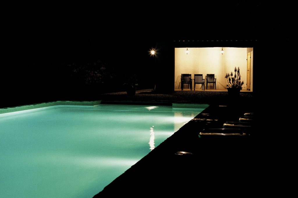
Alys Tomlinson | Dead Time | 2004 – 2006
June 23, 2023Alys Tomlinson | Dead Time | 2004 – 2006
“I like to remember things my own way.”
“What do you mean by that?”
“How I remember them. Not necessarily the way they happened.”
(from Lost Highway)
I’ve recently begun rewatching the third season of Twin Peaks (I mention this as Alys Tomlinson has spoken of Dead Time with allusions to the painter Edward Hopper but also that ephemeral notion of the Lynchian landscape): there’s a scene where Shawn Colvin’s version of Viva Las Vegas is a soft and enchanting soundtrack to the unfolding scene, and I happened to be listening to that song as I was perusing Tomlinson’s Dead Time series online. Vegas is, they say, a place where time is fluid, or can be lost or doesn’t exist in the same manner as elsewhere….
Tomlinson’s scenes are more Lynch’s Mulholland Drive or Lost Highway than Twin Peaks, with harsh artificial light casting edged shadows and revealing a sinister tableaux. Some critics have spoken of how time in the Lynchian universe – especially in Twin Peaks – is non linear, and Tomlinson’s images have an eerie familiarity (I’ve also travelled long distances by car and spent evenings in motels that, in recollection, blur together into one continuous banal experience).
There’s an element of the same unsettling darkness and emptiness that Steve Laurie employs in some of his images that also invite us to see them as film stills and create our own narratives for them. Tomlinson’s ‘America’ is empty, hard and bright. Swimming pools – usually sites of social interaction and enjoyment – are harbingers that seem more nefarious, here.
“For the past few years Alys has been photographing empty swimming pools at night in the UK and abroad. The images explore a twilight world of the in-between: a blurring of day and night, light and dark, the open and the enclosed, plenitude and absence. Whether municipal or members only, the pool is a space shaped by its patrons. Captured out of use, these familiar spaces stand outside time. Curved light breaks up the horizontal rigour. The comfort of transparency gives way to reflection and shadow. What is cedes to what could be, and the ordinary is transformed. The geographical location of each swimming pool is kept secret. Shot at dusk or at night, the pools take on a detached, almost melancholy, emptiness, and suggest a sinister feeling that something has happened, or is about to happen.” (from here)
Alys Tomlinson’s site can be seen here (she’s an award winning photographer and the diversity of her work speaks to her acumen with a lens, both formally and conceptually) and her IG is here. She has produced a book of these images, as well.
~ Bart Gazzola
Read More
Judith Schaechter | Eastern State Penitentiary | 2010-2011
June 16, 2023Judith Schaechter | Eastern State Penitentiary | 2010-2011
Schaechter works in a medium – stained glass – that is often consigned to the past, a method that most would be surprised to find is still employed by various artists. In terms of this, her thematic choices for this series of works installed in the Eastern State Penitentiary in Pennsylvania being a re interpretation of an allegory (most notably executed in 1559 by Pieter Breugel the Elder) that dates back over a thousand years is a melding of material and intent that literally shines.
It’s installation in a penitentiary offers even further intersections about indulgence and discipline, redemption and rashness, but also harkens to how this was a form of art that was essentially populist, offering narratives and stories to any who encounter it, even in unexpected places that foster moments of unanticipated joy.
Judith Schaechter is a very accomplished artist. She has lived and worked in Philadelphia since graduating in 1983 with a BFA from the Rhode Island School of Design Glass Program. She has exhibited widely across the United States, and has been the recipient of a Guggenheim Fellowship, two National Endowment for the Arts Fellowships in Crafts, The Louis Comfort Tiffany Award, The Joan Mitchell Award, two Pennsylvania Council on the Arts awards, The Pew Fellowship in the Arts, and a Leeway Foundation grant, and she is a 2008 USA Artists Rockefeller Fellow. Much more about her impressive career can be seen here.
An excerpt from her statement about her work:
“I found the beauty of glass to be the perfect counterpoint to ugly and difficult subjects. A radiant, transparent, glowing figure is not the same as a picture of a figure (which reflects light). It’s a blatant reference to holiness or some type of “supernatural” state of being. In terms of my figures, although they are intended to be ordinary people doing ordinary things, I see them as having much in common with the old medieval windows of saints and martyrs.
They seem to be caught in a transitional moment when despair becomes hope or darkness becomes inspiration. They seem poised between the threshold of everyday reality and epiphany, caught between tragedy and comedy.
It seems my work is centered on the idea of transforming the wretched into the beautiful in theme as well as design. For me, this means taking what is typically negative — say, unspeakable grief, unbearable sentimentality, or nerve-wracking ambivalence, and representing it in such a way that it is inviting and safe to contemplate and captivating to observe (to avoid ending with preposition). I am at one with those who believe art is a way of feeling one’s feelings in a deeper, more poignant way.
Medieval windows sought to confer inspiration and enlightenment to those who would see it. Beholding a stained glass window can enable, encourage, and literally enact the process of being filled with light. It sounds like some kind of preternatural phenomenon, but it’s a physical fact. While one is busy identifying and empathizing with the image, one also physically experiences the warming, filling sensations of light. It’s so persuasive not because the pictures are convincing narratives but because the colors are overwhelming and the light is sublime…”
Besides the imposing – perhaps edifying, considering its location – Lent work, Schaechter has also interspersed smaller slim artworks in various sites in the Penitentiary, with titles that evoke emotion and consideration like The Weeping Chorus, Confines, Mother or Sister.
Prisons are spaces that we ignore in most conversations about society, let alone cultural communities: except for when the ‘debate’ rears its ugly head in the public sphere about whether they are spaces designed for rehabilitation or purely for a punitive joy that usually seems to have a vague stench of hypocrisy about it. In imagining what it would be like to stand in the presence of these works, the idea of ‘redemption’ – a word I am uncomfortable with, as like too many words it is used with a biased or easy intent – comes to mind.
More of Judith Schaechter’s unique artwork can be seen here.
~ Bart Gazzola
Read More
Recent Comments