In: Feminist Art
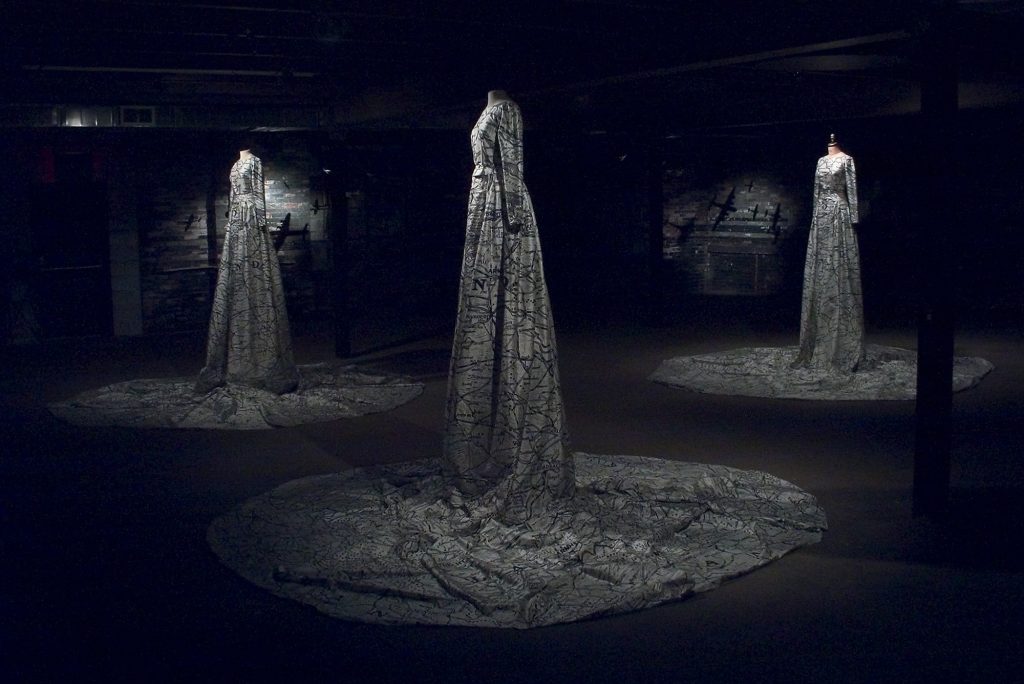
War Map Dress Trilogy | Carolyn Wren, 2003-2004
June 30, 2022Carolyn Wren | War Map Dress Trilogy, 2003-2004
(lino blocks, hand-printed on Dupont silk, thread, zippers, mannequins, model airplanes, black paint)
I encountered these towering figures during Wren’s retrospective exhibition Task At Hand at the now shuttered Rodman Hall Art Centre several years ago. Standing in the large back gallery space, the three female figures dominated the room, with the flow of their dresses spilling out from them, pooling around them on the gallery floor.
Visiting this show numerous times, I found that different ideas came to the fore with different interactions, from initial wonder to later, more critical consideration. When an artist / writer friend, Anna Szaflarski, visiting Niagara, came with me on one occasion, she saw the works in a very different light than I had, initially. Unsurprising, really, as when Szaflarski and I first met, it was around her exhibition at NAC about the historical detritus – or lack thereof – of General Motors’ legacy in St. Catharines, and I believe we connected over an irreverent honesty about history, the region, and the intersecting if conflicting stories of the place we both grew up in….
My reading had been informed by Wren’s own words, which are as follows: The ingenuity of Christopher Clayton Hutton’s invention of silk maps for the British Royal Air Force during World War II enabled pilots to use lightweight and durable maps to help them reach safety in times of crisis, and inspired women to make dresses out of the silk maps as their men returned home. The maps used by Wren in the dresses were made in Europe by the Canadian government and shipped to Canada for families to follow the movements of their loved ones fighting in the war. Alluding to multiple layers of symbolism of the landscape in relation to the body, and reflecting on war and the politics of Feminism (viewpoint, memory, and identity), The War Map Dress Trilogy is more about history, location, distances, than it is about terrain.
I talk a lot about ‘contested narratives’: but this story, this Curator’s Pick is very much about that. Szaflarski – a former student of Wren’s, as Caroline taught in Niagara for some time, and helped shape a few generations of artists and art appreciators – upon seeing the exhibition, and these ‘women’, spoke more in a manner reminiscent of Barbara Kruger’s famous – and still relevant – artwork that declares that YOUR BODY IS A BATTLEGROUND. These battlefield maps, on dresses hanging on mannequins without heads or hands, look more like spaces to be attacked, or acted upon, utterly passive and just victims…. (“Afterwards she could not walk for a week, her feet would not fit into her shoes, they were too swollen. It was the feet they’d do, for a first offence. They used steel cables, frayed at the ends. After that the hands. They didn’t care what they did to your feet and hands, even if it was permanent. Remember, said Aunt Lydia. For our purposes your feet and your hands are not essential.” Margaret Atwood, A Handmaid’s Tale).
More of Carolyn Wren’s work can be seen here. A recent curatorial project of mine, based upon the Rodman Hall Collection, and which included Wren’s work, can be seen here.
Photographs are by Sandy Fairbairn and the author.
~ Bart Gazzola
Read More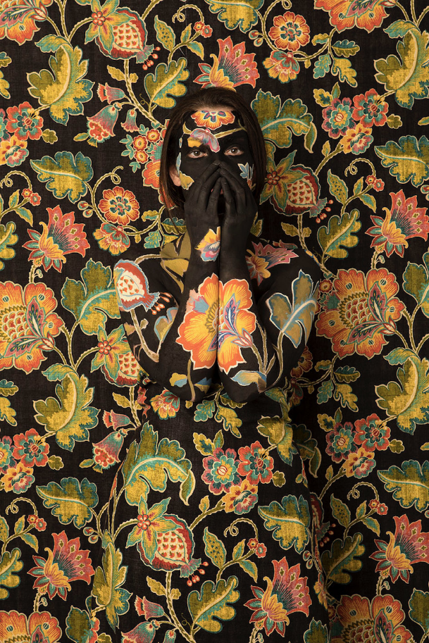
The Whisper | Cecilia Paredes, 2021
March 31, 2022The Whisper | Cecilia Paredes, 2021
“I’ve got out at last,” said I, “in spite of you and Jane. And I’ve pulled off most of the paper, so you can’t put me back!”
Now why should that man have fainted? But he did, and right across my path by the wall, so that I had to creep over him every time!”
(The Yellow Wallpaper, Charlotte Perkins Gilman)
Paredes’ self portraits are unsettling: in this one, she actually makes eye contact with us, making it harder to ignore, yet easier to ‘find’ her, within the composition. Though her work is a performative metaphor for our relationship with the environment, one can’t help but also see a statement about women and the still too frequent dismissal of female artists, in her artworks. The ‘wallpaper’ of The Whisper – in conversation with a friend – brought to mind the story I cited at the beginning of this piece, which was published in 1892, and touches upon many of the themes I’ve mentioned. This story can be read here: but I offer a brief taste of its haunting narrative below.
The narrator devotes many journal entries to describing the wallpaper in the room – its “sickly” color, its “yellow” smell, its bizarre and disturbing pattern like “an interminable string of toadstools, budding and sprouting in endless convolutions,” its missing patches, and the way it leaves yellow smears on the skin and clothing of anyone who touches it. She describes how the longer one stays in the bedroom, the more the wallpaper appears to mutate, especially in the moonlight. With no stimulus other than the wallpaper, the pattern and designs become increasingly intriguing to the narrator. She soon begins to see a figure in the design. Eventually, she comes to believe that a woman is creeping on all fours behind the pattern. Believing she must free the woman in the wallpaper, she begins to strip the remaining paper off the wall.
‘Cecilia Paredes creates self-portraits that play with disguise and metamorphosis. She is known for a series in which she appears to vanish into a graphic backdrop. These “photo performances,” as the artist calls them, often involve her painting herself with bright, intricate patterns before documenting her body against a wall of the same motifs. Influenced by nature, Paredes also transforms herself into animals in realistic, glamorous studio portraits….Paying tribute to the flora and fauna of her native Peru, Paredes creates layered statements of her own identity. Her works also speak to humans’ relationship with nature and our responsibility to threatened environments.’ (from here)
More of her work can be seen at her Instagram @ceciliaparedesarte and a longer article about this series can be enjoyed here.
~ Bart Gazzola
Read More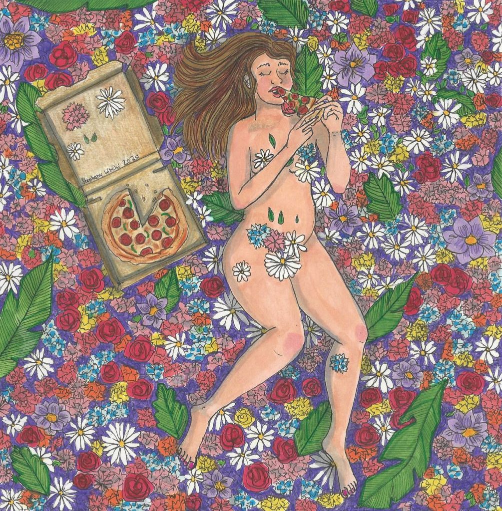
Stéphany Gagnon – Cinéma / Cinema – Femme Folks Fest
March 15, 2022Stéphany Gagnon | Cinema
I am of an age where I remember receiving a copy of the Canadian Children’s Annual every year for christmas from my parents. I recently purchased a used copy of the 1976 version, the original lost long ago during a past relocation between cities. These books contained what were among the first artworks that I ever inteacted with… in 1975 with a cover by William Kurelek, in 1976 by Lynn Frank (Lynn Johnston of For Better or For Worse fame), in 1977 by Toller Cranston and in 1978 by Ken Danby. These were not lightweight artists. Each were on their way to becoming, or already were, prominent Canadian artists.
Leafing through, I was pleasantly surprised at the memories that were brought back by the illustrations in the book… I remembered every one of those images very clearly. Not only the images, but memories of the rooms, emotions and peoples that are forever tied to those images sprang my mind. It was an like instant recall machine.
The illustraions and paintings of Montreal’s Stéphany Gagnon seem to me to have a similar magic to them. Gagnon’s work is deeply personal, with great attention to detail. It can be ethereally dreamy, but also lucid dreamy, as shown by Cinéma (above) and Lemonade Stand (below). Both seem to tug at places in your brain, looking for memories to associate with them. They are in some sense, lost art, looking for a home.
You can view (and purchase) more of Stéphany’s work on her Instgram page @stephanylitchi.
~ Mark Walton
Read More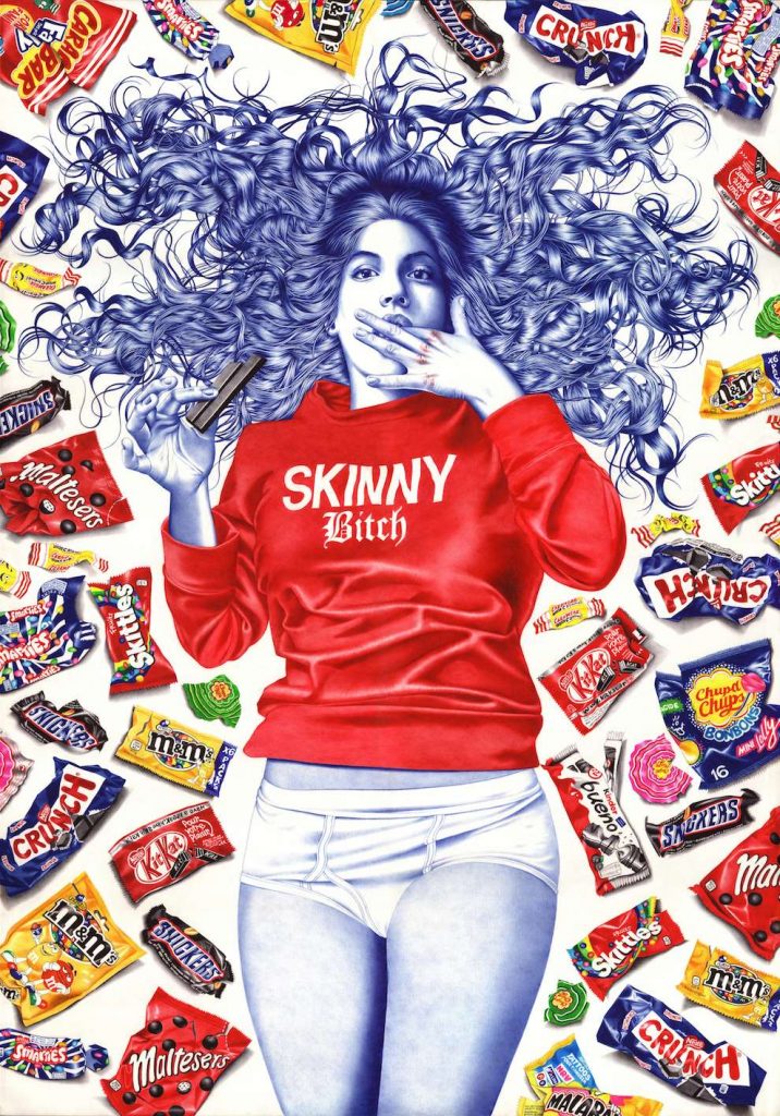
Mia | Helena Hauss, 2015
February 14, 2022Mia | Helena Hauss, 2015
One of my favourite scenes from the television series Sense8 is when one of the main characters is about to step into the ring, for an underground boxing match; a match between a male and female fighter – and the referee, in response to the man’s bravado, his arrogant assurance of his victory, is that “smart money’s on the skinny bitch.”
And the “smart money” turns out to be right.
Helena Hauss’ images are definitively feminist, but with a forceful humour that amuses and fractures a simplistic reading of her work. The aforementioned exchange came to mind due to the shirt worn by Hauss’ Mia, proudly proclaiming ‘skinny bitch’, as she reclines amidst tasty decadent snacks, not just unmindful of our judgement but meeting our gaze straight on, provocatively licking her fingers with eyes that make it clear she couldn’t give less of a fuck about what ‘we’ think.
Hauss works in ballpoint pen: her skill and discipline in this unusual format is awe inspiring, and there’s an audacity required in employing this medium that is matched by the vivacity and authenticity of the players in her tableaux. Whether in Mia’s unflinching stare, or the energy of The Fight or the impressive minutiae and detailed renderings of The Bet or The Sleepover, Helena Hauss is awesome in her medium.
Her words: My works all explore a same running theme of Irreverence : challenging an imposed decorum and reveling in one’s own pre-established labels rather than having to apologize for them.It’s about self-acceptance through self-deprecation and satire.
More of Helana Hauss’ work can be seen at her site, and her IG: @helenahauss.
She often shares videos of her process, which is lovely to enjoy as well.
~ Bart Gazzola
Read More
Recent Comments