In: curators pick
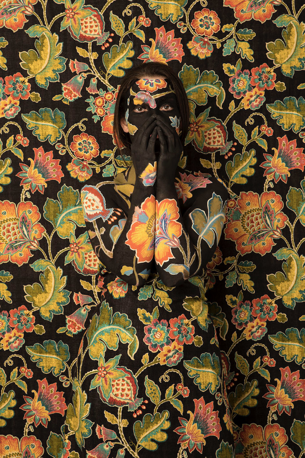
The Whisper | Cecilia Paredes, 2021
March 31, 2022The Whisper | Cecilia Paredes, 2021
“I’ve got out at last,” said I, “in spite of you and Jane. And I’ve pulled off most of the paper, so you can’t put me back!”
Now why should that man have fainted? But he did, and right across my path by the wall, so that I had to creep over him every time!”
(The Yellow Wallpaper, Charlotte Perkins Gilman)
Paredes’ self portraits are unsettling: in this one, she actually makes eye contact with us, making it harder to ignore, yet easier to ‘find’ her, within the composition. Though her work is a performative metaphor for our relationship with the environment, one can’t help but also see a statement about women and the still too frequent dismissal of female artists, in her artworks. The ‘wallpaper’ of The Whisper – in conversation with a friend – brought to mind the story I cited at the beginning of this piece, which was published in 1892, and touches upon many of the themes I’ve mentioned. This story can be read here: but I offer a brief taste of its haunting narrative below.
The narrator devotes many journal entries to describing the wallpaper in the room – its “sickly” color, its “yellow” smell, its bizarre and disturbing pattern like “an interminable string of toadstools, budding and sprouting in endless convolutions,” its missing patches, and the way it leaves yellow smears on the skin and clothing of anyone who touches it. She describes how the longer one stays in the bedroom, the more the wallpaper appears to mutate, especially in the moonlight. With no stimulus other than the wallpaper, the pattern and designs become increasingly intriguing to the narrator. She soon begins to see a figure in the design. Eventually, she comes to believe that a woman is creeping on all fours behind the pattern. Believing she must free the woman in the wallpaper, she begins to strip the remaining paper off the wall.
‘Cecilia Paredes creates self-portraits that play with disguise and metamorphosis. She is known for a series in which she appears to vanish into a graphic backdrop. These “photo performances,” as the artist calls them, often involve her painting herself with bright, intricate patterns before documenting her body against a wall of the same motifs. Influenced by nature, Paredes also transforms herself into animals in realistic, glamorous studio portraits….Paying tribute to the flora and fauna of her native Peru, Paredes creates layered statements of her own identity. Her works also speak to humans’ relationship with nature and our responsibility to threatened environments.’ (from here)
More of her work can be seen at her Instagram @ceciliaparedesarte and a longer article about this series can be enjoyed here.
~ Bart Gazzola
Read More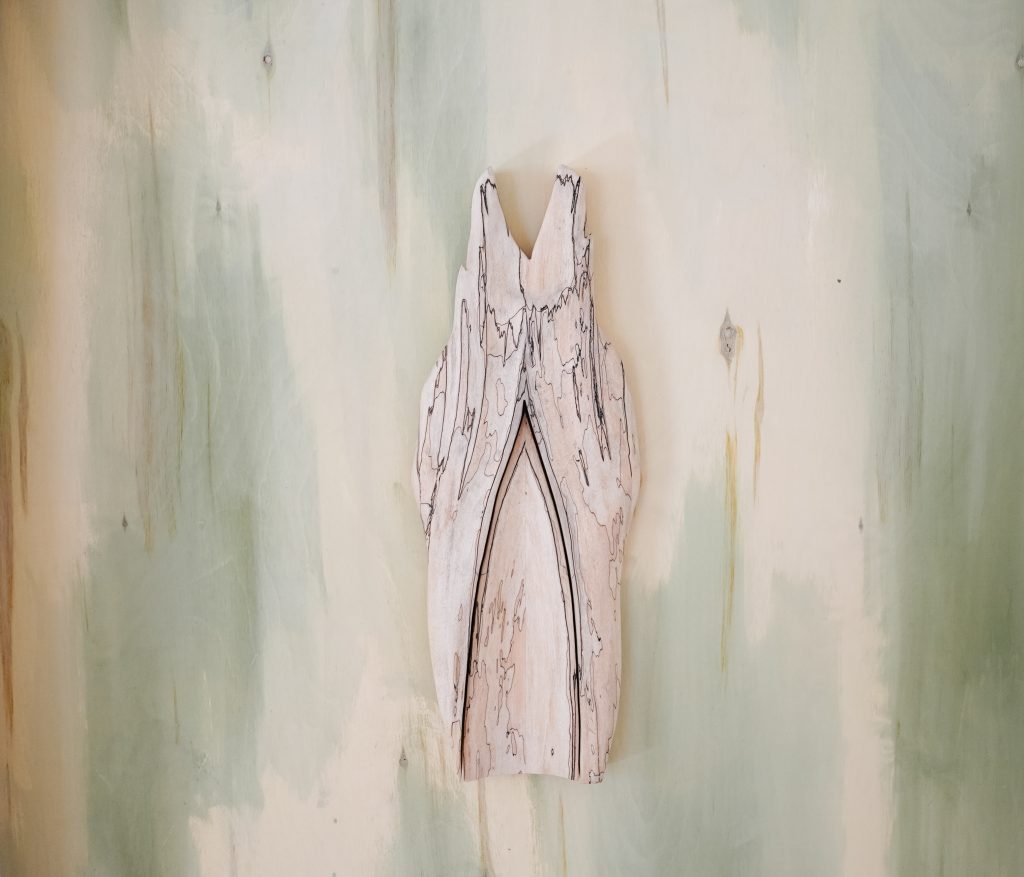
Megan Feniak | Listily Lean
March 28, 2022Megan Feniak | Listily Lean
Warm wood elements and ethereal, textured lines swirl around a white washed room, bathed in natural light. Megan Feniak’s show, Listily Lean, is simultaneously methodical and untethered: an open reflection on currents of desire in the context of religious experience.
The show’s title comes from a passage in a 14th century mystical text, The Cloud of Unknowing: “lean listily to this meek stirring of love in thine heart, and follow thereafter.” The artist notes the discontinued use of the word, listing, and motions to define it by what it is not: the more commonly used term listless, having no energy or enthusiasm (Oxford Dictionary). She describes leaning listily as “to chase, or to follow with an eagerness- an insatiable craving” a craving that is distinct from the negative connotations associated with the word lust. And it is so, the work is not a passive series of pieces but acts in unison, as one figurative brush stroke that embodies action, momentum, a burst of motion toward and in pursuit. Of what exactly? Only the artist knows.
Influenced by the works of Christian mystics, Feniak describes the research leading up to her show as circling around Anne Carson’s text, Eros the Bittersweet. This helped frame Feniak’s own work around eros as both pleasure and pain and to also speak to lack. Feniak describes the paradox of desire as “sustained only as long as the desired is out of reach. Absence is the surprising factor in the equation of desire” and quotes Carson in saying, “for (their) delight is in reaching; to reach for something perfect would be perfect delight” (Eros the Bittersweet 69).
According to Feniak, it is this act of reaching for something perfect that is both the joy and the confounding dilemma of mystics. In her work, she listily leans to understand; hungrily, painfully yearns to both capture and test the limits of human desire.
To stretch the title even further, the pieces also appear to have a desired lean, pared down feel to them, while their earnest presence marks the space with an overwhelming sense of profundity and wistfulness. The eagerness and motion indicated by the title is captivated by the fragments of wood carvings and sculpture, dispersed throughout the room and woven together by the strokes of fluidity marked by the lighter, wispy elements of show. The intensities of desire and delight are stitched by the deeply spiritual threads of mysticism and relish in a dreamlike experience beyond the daily and mundane.
In describing the show, I apply the artist’s own method of distilling “listily”– by describing what it is not. It is not loud nor sanctimonious, but it is not quiet. It is not self-congratulatory and yet it is not meek. It is not frozen in one specific time or place, but feels as though it is part of a continuum, both for the artist but also for a more universal theme of human relation to divine exploration. In the same way that spiritual practice shatters human perception and notions of boundary, Listily Lean creates a bodily intimacy with the abstract and leaves us craving for more.
Megan Feniak received her BFA from the Alberta University of the Arts in 2018, and MFA from the University of Guelph in 2021. Working in sculpture and woodcarving, her sculptures intimate the power of affects, gestures, and the positioning of the body in ritual and belief.
Website: http://www.meganfeniak.com
Instagram: @fenny__.__
~ Paulette Cameron
Read More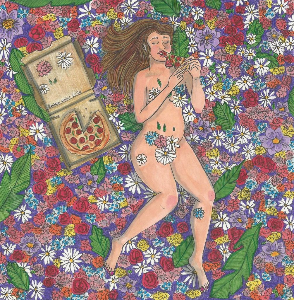
Stéphany Gagnon – Cinéma / Cinema – Femme Folks Fest
March 15, 2022Stéphany Gagnon | Cinema
I am of an age where I remember receiving a copy of the Canadian Children’s Annual every year for christmas from my parents. I recently purchased a used copy of the 1976 version, the original lost long ago during a past relocation between cities. These books contained what were among the first artworks that I ever inteacted with… in 1975 with a cover by William Kurelek, in 1976 by Lynn Frank (Lynn Johnston of For Better or For Worse fame), in 1977 by Toller Cranston and in 1978 by Ken Danby. These were not lightweight artists. Each were on their way to becoming, or already were, prominent Canadian artists.
Leafing through, I was pleasantly surprised at the memories that were brought back by the illustrations in the book… I remembered every one of those images very clearly. Not only the images, but memories of the rooms, emotions and peoples that are forever tied to those images sprang my mind. It was an like instant recall machine.
The illustraions and paintings of Montreal’s Stéphany Gagnon seem to me to have a similar magic to them. Gagnon’s work is deeply personal, with great attention to detail. It can be ethereally dreamy, but also lucid dreamy, as shown by Cinéma (above) and Lemonade Stand (below). Both seem to tug at places in your brain, looking for memories to associate with them. They are in some sense, lost art, looking for a home.
You can view (and purchase) more of Stéphany’s work on her Instgram page @stephanylitchi.
~ Mark Walton
Read More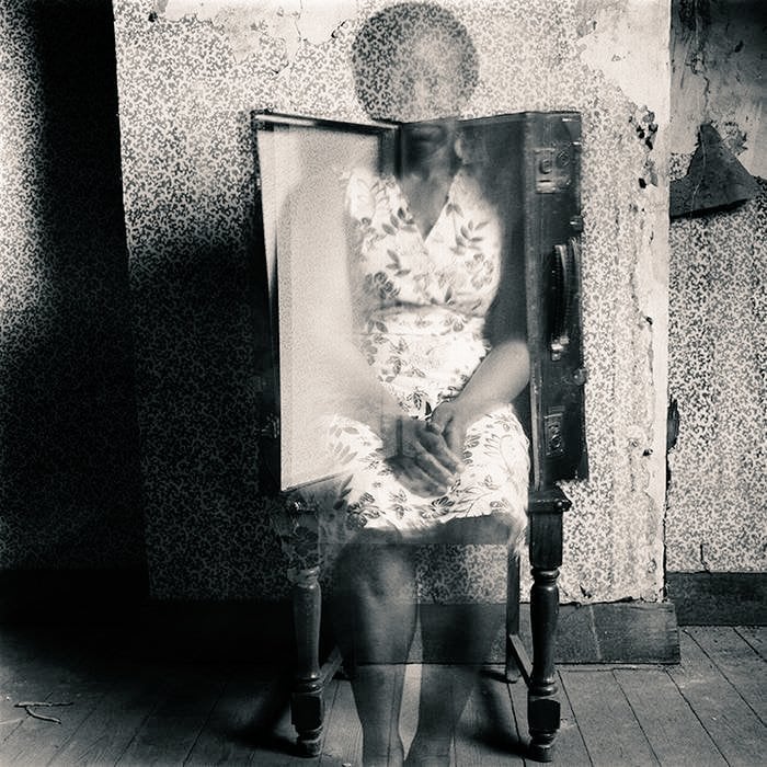
Hélène Amouzou | Between the Wallpaper and the Wall, Belgium / Togo, 2004-2011
March 24, 2022Hélène Amouzou | Between the Wallpaper and the Wall, Belgium / Togo, 2004-2011
Foreigners forget their place (having left it behind). Given time, they begin to think of themselves as our equals. It is an unavoidable hazard. (Salman Rushdie, Christopher Columbus and Queen Isabella of Spain Consummate Their Relationship, Santa Fe, January, 1492, from his book East, West)
Rushdie’s characters are dripping with entitled sarcasm, in that story I cited. They could never imagine themselves as being foreign, or displaced, or not the gatekeepers – or the owners – of a place. Hélène Amouzou’s images from her series Between the Wallpaper and the Wall, Belgium/Togo, 2004-2011 originate from the opposite side of that conversation, and the ghostly, ephemeral nature of her self portraits speaks to a doubt, a dismissal, even, that is too often the immigrant experience.
“They describe us,” the other whispered solemnly. “That’s all. They have the power of description, and we succumb to the pictures they construct.” (Rushdie, again, from the chapter Ellowen Deeowen, of The Satanic Verses, entailing the suffering of immigrants in a manner that is both a casual brutality and magical realism, where words become reality. If you’re familiar with this text, the idea that someone might fade from sight, like dissipating mist if willfully ignored, fits right in….).
Inspired by the work of Francesca Woodman, Hélène Amouzou creates her own distinctive and haunting imagery, which speaks of the contemporary issue of the displacement of people and those in exile. Born in Togo, Amouzou now lives and work in Belgium. The photographs were taken during a two year period when Amouzou was seeking asylum there and waiting for her official residency visa. She captures herself or her belongings (often her clothes) in an empty room with peeling floral wallpaper. In many of the images she includes a suitcase as a recurrent symbol of her state of flux and transit. She works with film rather than digital media, preferring the effects of chance and serendipity and she exploits the use of long exposures, playing with the photographic medium to create ephemeral and ghostly self-portraits. “Self-portraiture is a way of writing without words,” Amouzou says. “My aim is to reveal the deepest parts of myself.”
These photographs reveal a constant questioning and search for the subject’s identity. Notions of freedom and legitimacy are explored in a world of bureaucracy and inequalities. Amouzou captures feelings of exclusion and the stigmatization by the lengthy official process. Those with permanent residency rights can only imagine the insecurity and daily worry of the possibility of being sent back to an unsafe place and the photographs reveal this sense of impermanence. Her ghostly images haunt each frame and hover in the no-man’s land between absence and presence. (from Juxtapoz)
More of Hélène Amouzou’s work can be seen here. ~ Bart Gazzola
Read More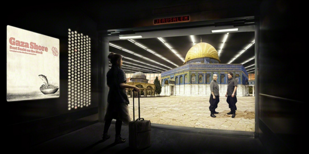
Jerusalem floor, 2012 | Larissa Sansour
March 22, 2022Jerusalem floor, 2012 | Larissa Sansour
Jerusalem floor, 2012 | Larissa Sansour, C-print (23 3/5 × 47 1/5 in / 60 × 120 cm)
On the flight from London I sit opposite a rumble seat where the stewardess places herself during takeoff. The stewardess is an Asian woman with a faraway look. I ask how often she makes this flight. Once or twice a month. Does she enjoy Israel? Not much. She stays in a hotel in Tel Aviv. She goes to the beach. She flies back. What about Jerusalem? She has not been there. What is in Jerusalem?
The illustrated guidebook shows a medieval map of the world. The map is round. The sun has a beard of fire. All the rivers of the world spew from the mouth of the moon. At the center of the world is Jerusalem. (Robert Rodriguez, The God of the Desert, Harper’s Magazine)
One can’t help but be thinking of the displaced, of refugees fleeing strife, with the situation in Eastern Europe right now; and let’s be frank – not all refugees are ‘equal’ with race and geopolitics rearing their ugly heads, as we see in both the history and present of Canada, and the wider world. I’m not often a fan of Ai Weiwei, but his work about Alan Kurdi touched a nerve that many of us may not have known – or my still deny – was exposed.
In light of that unpleasant reality, the works of Larissa Sansour, a Palestinian born artist were on my mind this week, especially her series Nation Estate. Jerusalem is not a neutral place, or an unloaded term. It may be the best example in ‘Western’ nation states – though in the Middle East – of a place that is intensely contested, an apex of Salman Rushdie’s notion of an ‘imaginary homeland.’
Even that tepid taupe of Wikipedia offers this: Given the city’s central position in both Israeli nationalism and Palestinian nationalism, the selectivity required to summarize more than 6,000 years of inhabited history is often influenced by ideological bias or background (please see Historiography and nationalism).
“In her Nation Estate (2012) series, Sansour conceptualizes an immense high-rise as a new home for her people. In each digitally manipulated photograph in this series, she places herself on a different floor of the edifice. We see her travel from the main lobby, to the Dead Sea, to Gaza, all in the space of a single building.”
“….Nation Estate takes place…in a mammoth high-rise that houses the entirety of the Palestinian people in one easy-to-navigate complex. Blurring the lines between utopian and dystopian realities, she paints a seemingly peaceful, albeit unfathomably sterile future where walls cease to function as barriers to human interaction.
“In a way there’s something positive about ‘Nation Estate.’ There are no check points and people can visit one city from another just by the use of the elevators. It’s an easy life that questions progress in general. Certain things are becoming easier, yet this skyscraper environment is completely inorganic,” Sansour stated. “It’s actually really a mockery when you think about it — living in a skyscraper. So it’s completely dystopian in the end.” (from here)
Who is a ‘real’ refugee? Who has a ‘right’ to live in a space, and to claim that they ‘own’ the land? Sansour’s works have often addressed this; we live in a world where to be Palestinian is often dismissed as illegitimate, if even ‘legal’, whatever that might even mean. Perhaps, as alluded to in Sansour’s work, the idea of ownership and wealth not only preclude but define / deform what it means to be a citizen, or even to be human.
In looking at this work, I also cannot help but consider the lament of Psalm 137: For how are we to sing the Lord’s song in a strange land?
You can see more of her work at her site, and her Instagram is @larissasansour.
~ Bart Gazzola
Read More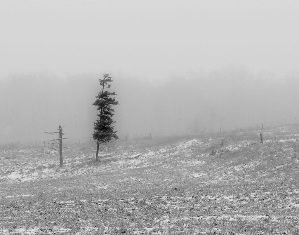
Essay – Ron Hewson – Community Galleries
March 1, 2022Community Galleries
I’ve been putting a lot time and effort lately into a community gallery that I belong to. While doing this I’ve put some thought into why I feel it’s worth the effort. Here are some of my reasons to to belong to and participating in this endeavour.
I believe it’s important for local artists to have a place to hang their work. Putting my work on a wall in a public space means I feel that I have created something that is worthy of public display. This matters because the emotional investment in producing art needs that outlet. Showing in a gallery is the reward for the time and money put into our work. I know I would continue to work regardless of belonging to a gallery but knowing that I can share what I have made is incentive to keep working.
Belonging to the gallery means I have to finish things. Every couple months I need new framed finished work to display. As a photographer I can capture a vast number of images. However that really doesn’t mean anything if I don’t finish any of them. Sure I can do some quick editing and post them on Instagram or do some more careful work and post on a stock photo site but that’s not the same as taking the extra steps to print and frame something. The incentive to finish work is a big benefit of belonging to the gallery.
Preparing work for the community gallery on a regular basis is far less stressful that preparing for a major gallery show. I’ve done shows at “big” galleries. The thrill and sense of accomplishment that comes from that kind of show can’t be beat. But the investment in time and money can be overwhelming. Its not something that everyone is prepared to do or is willing to do and for most people its out of reach. The community gallery fills that need perfectly. It gives the opportunity to exhibit that is manageable for artists who want to exhibit without the stress of a solo show.
There are many other reason the gallery is worth my time such as the diversity of the art on display and the camaraderie of follow artists but what makes to gallery valuable to me is the incentive to keep working. I believe that everyone needs some form of incentive and that for me is to have my photography physically present in the world. While posting something online might get seen by lots of people we don’t paint or sculpt or create our art to be seen on a phone.
Visit uptowngallerywaterloo.com
~ Ron Hewson
Read More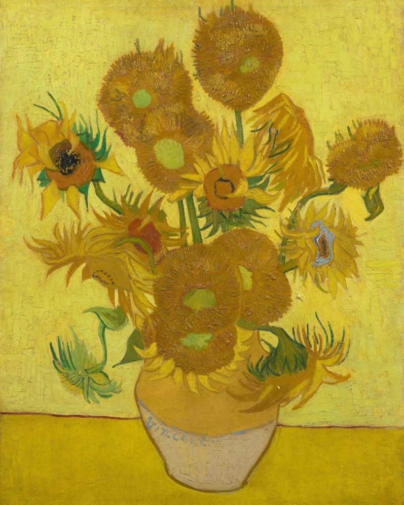
Put sunflower seeds in your pocket so they grow when you die | Van Gogh’s Sunflowers. 1889
February 26, 2022Put sunflower seeds in your pocket so they grow when you die | Van Gogh’s Sunflowers. 1889
It is an understatement to say that many of us have Ukraine in our thoughts, right now. Historians have commented that coverage of many past conflicts have been defined by technological advancements (such as Vietnam with television, or the first Persian Gulf conflict, with it’s almost video game style graphics); the ongoing Russian invasion of Ukraine has already become one that is being seen – and perhaps shaped – by the internet, with streaming and social media.
A recent exchange between a brave Ukrainian woman and Russian soldiers brought to mind the work we’re featuring here (Vincent Van Gogh’s Sunflowers).
From The Guardian: “A woman is being hailed on social media after she confronted a heavily armed Russian soldier and offered him sunflower seeds – so that flowers would grow if he died there on Ukraine’s soil. ‘You’re occupants, you’re fascists,’ she shouts, standing about a metre from the soldier.”
She goes on to command them to “take these seeds and put them in your pockets so at least sunflowers will grow when you all lie down here.”
You can see the video of that interaction here.
If it seems a bit crass to cite Van Gogh here, it’s good to remember his work has become a symbol of hope against adversity, of beauty in the midst of pain and suffering, and – possibly – that there is more good than bad in the world. Or, perhaps, it’s more about defiance in the face of difficult odds, and how history – against our trepidations – can be an appropriate judge of contemporary events.
There’s a number of ways you can support the people of Ukraine here, and it’s worth noting that Canada has the world’s third-largest Ukrainian population, so our neighbours and friends are surely watching this with hope and fear. ~ Bart Gazzola & Mark Walton
Read More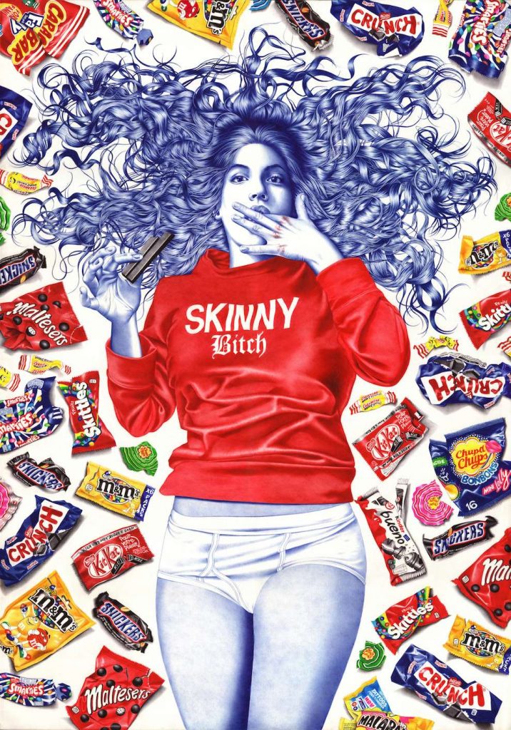
Mia | Helena Hauss, 2015
February 14, 2022Mia | Helena Hauss, 2015
One of my favourite scenes from the television series Sense8 is when one of the main characters is about to step into the ring, for an underground boxing match; a match between a male and female fighter – and the referee, in response to the man’s bravado, his arrogant assurance of his victory, is that “smart money’s on the skinny bitch.”
And the “smart money” turns out to be right.
Helena Hauss’ images are definitively feminist, but with a forceful humour that amuses and fractures a simplistic reading of her work. The aforementioned exchange came to mind due to the shirt worn by Hauss’ Mia, proudly proclaiming ‘skinny bitch’, as she reclines amidst tasty decadent snacks, not just unmindful of our judgement but meeting our gaze straight on, provocatively licking her fingers with eyes that make it clear she couldn’t give less of a fuck about what ‘we’ think.
Hauss works in ballpoint pen: her skill and discipline in this unusual format is awe inspiring, and there’s an audacity required in employing this medium that is matched by the vivacity and authenticity of the players in her tableaux. Whether in Mia’s unflinching stare, or the energy of The Fight or the impressive minutiae and detailed renderings of The Bet or The Sleepover, Helena Hauss is awesome in her medium.
Her words: My works all explore a same running theme of Irreverence : challenging an imposed decorum and reveling in one’s own pre-established labels rather than having to apologize for them.It’s about self-acceptance through self-deprecation and satire.
More of Helana Hauss’ work can be seen at her site, and her IG: @helenahauss.
She often shares videos of her process, which is lovely to enjoy as well.
~ Bart Gazzola
Read More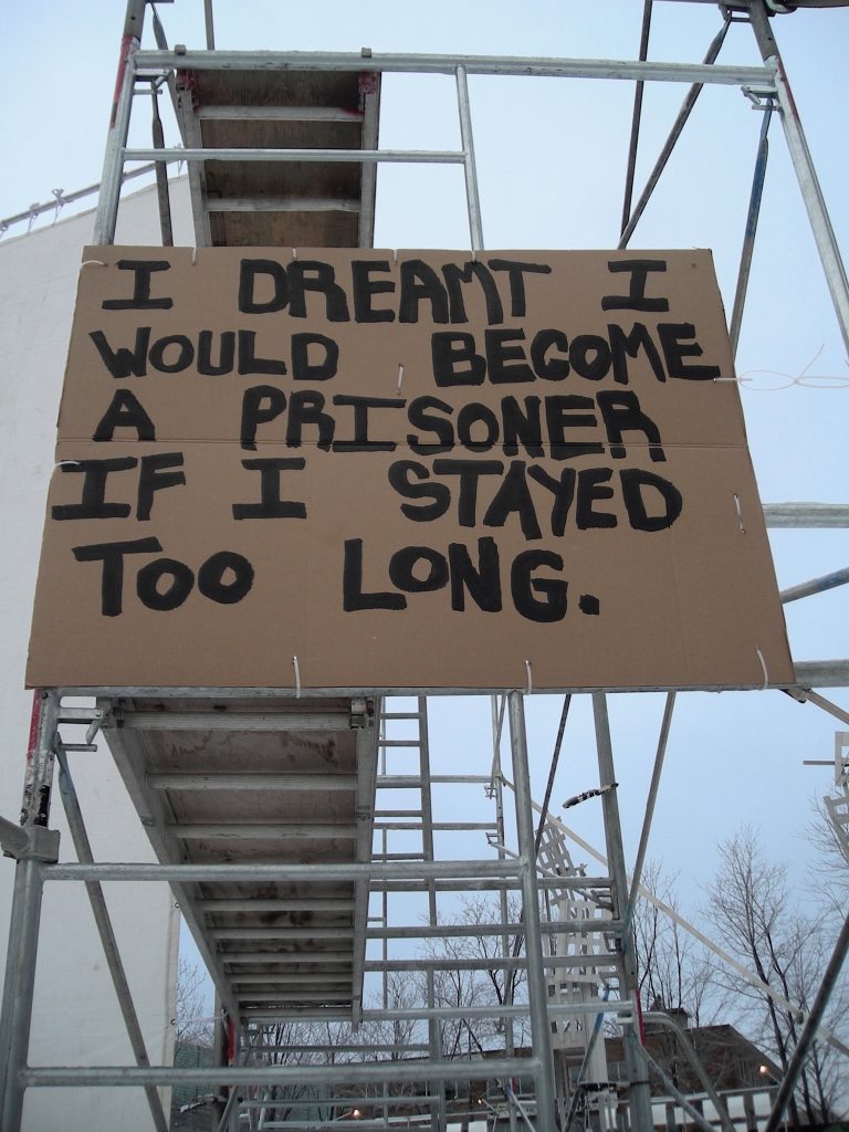
dream listener | karen elaine spencer, 2006 – 2007
February 4, 2022dream listener | karen elaine spencer, 2006 – 2007
In a dream I saw a way to survive and was filled with joy. (Holzer)
I have dreamed a dream, but now that dream is gone from me. (The Matrix: Reloaded)
i wrote my dream on cardboard, went out into the street and held the cardboard dream in front of me. at the end of the day i abandoned the cardboard dream. over the year one hundred and ninety-four dreams were written on cardboard and shared this way. (karen elaine spencer)
There is a poetic brutality to karen spencer’s dream listener porteur de rêves works, and especially several that she’s shared online recently, looking backwards at this series. (The image I’m sharing here is from 2007)
These are stark images, both visually and in terms of what spencer has chosen to present. spencer and I became acquainted when she exhibited a postcard/billboard project (using an image taken from her first invitation with ATSA’s l’État d’urgence) in Saskatoon some time ago; we joked about how both of us liked to walk in the frigid temperatures of our respective cities, and how that gave us a different sense of the place and the people. spencer often seems to notice things that others ignore, in these images: sometimes those are discarded objects. Often they are detritus, or indicators, of discarded people. spencer’s work is very political, and often in the public sphere, as well.
“Her work questions the hierarchy inherent in use values and investigates how we, as transient beings, occupy the world we live in. The widely held belief in a linear movement forward, or “progress”, is confronted through her repetition of actions that lead nowhere. Rambling, dreaming, loitering and riding the metro are all activities spencer has previously undertaken as part of her practice. Actions are sustained over time (often a year or more) rendering her artistic practice indistinguishable from her daily life. She works with what is near at hand, materials that speak of our day-to-day existence: cardboard, oranges, bread, chalk. Through a détournement of materials or intentions spencer intervenes into spaces; hoping to shift, even if only ever so slightly, our perceptions of what is possible.” (from The New Gallery)
spencer’s words are plaintive yet engaging. There’s a sadness evoked that seems to speak to you, on a very personal level. Her other texts in this series are equally melancholic: I dreamed my insides were falling out astride a pile of domestic discards, i dreamt i wanted nothing more to do with death, i dreamt i was waiting but i don’t know what for and i dreamed i lay in a puddle and watched the rain fall on me (the latter two both on wood that we all recognize as that used to board up windows, an arbiter of damaged, empty – unwanted – spaces).
More of the dream listener interventions can be seen here. More contemporary works by spencer can be found on her IG feed: @karenelainespencer
~ Bart Gazzola
Read More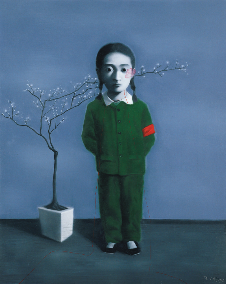
Zhang Xiaogang | Girl and Tree, 2007 – 2008 – December, 2021
December 29, 2021Zhang Xiaogang | Girl and Tree, 2007 – 2008
Several years ago, a friend suggested Jan Wong’s book Red China Blues: My Long March From Mao to Now to me. It was a memoir that touched upon major historical events, but always with a personal stance of Wong’s experiences as both the child of Chinese immigrants to Canada, but also as a person who, as a teenager in the late 1960s, was enamoured of Mao Tse Tung, and lived for some time in China during the Cultural Revolution. Years later – as chronicled in the book – she would be in Beijing when the Tiannamen Square Massacre happened. It’s a good book: Wong is a meticulous narrator, and spares neither her young self, nor larger mythologies of the State (whether China or Canada) from an older, wiser voice of criticism.
When I first encountered the work of Zhang Xiaogang, Wong’s stories of the Cultural Revolution (which she was protected from, being a Canadian still too anaesthetized by ideology over reality) immediately came to mind. Zhang’s figures are grim: they also make me recall a ‘joke’ from another friend, whose family fled communist Poland, about ‘Soviet photo face.’ This is the idea – which any cursory review of official photography from the USSR, or any totalitarian state, really, will reveal – that you must offer a facial expression, in all images, that is neutral, lest it be used against you later, and you find yourself in the gulag or a re education camp.
“Inspired by contemporary tensions in China, Zhang Xiaogang makes grim, unsettling portraits that consider identity and heredity in a collectivist state. The artist draws on influences that include political iconography, Chinese charcoal drawings, distorted Surrealist compositions, and family portraits from the Cultural Revolution era. His paintings, often executed in grisaille with bursts of bright yellow or red at the center, explore how varied individual histories are flattened into conformist representations.” (from here, where you can enjoy more of Zhang Xiaogang’s artwork) ~ Bart Gazzola
Read More
Recent Comments